Crafting a personal journey across time
A reflection tool to connect with your past self and inspire your future self
May 2021 – July 2021
This case study provides a glimpse into the design process behind an iOS app concept addressing a real-world challenge.
Index
-
1 - Context
An approach to the problem statement, goal, research findings and tools used.
-
2 - The idea
The project background and the gaps it aims to fill.
-
3 - Identity
Quick look to the visual identity designed for the project.
-
4 - Interaction Inspiration
The 1956 invention that inspired a key component of the app experience.
-
5 - Ideation
Overview of the sketching and wireframing phases.
-
6 - User Interface Design
A comprehensive UI walkthrough and the most important elements
-
7 - Iterations
Summary of the insights learned during the design process.
-
8 - Afterword
Main takeaways and special thanks.
1 - Context
Date
May 2021 – July 2021
The problem
Therapeutic journaling exercises, such as writing letters to your past or future self, are common tools for emotional healing and self-reflection. However, these activities are usually done with pen and paper or generic note-taking tools, which can feel disconnected from how people communicate and reflect today. For many, especially those new or hesitant about therapy, these exercises can seem intimidating, emotionally challenging, or like extra homework rather than a helpful, engaging practice.
The goal
Design a digital experience that supports emotional reflection through messages to one’s past and future selves. The product should feel approachable and safe, making it easier for both people in therapy and those exploring mental health on their own to engage in self-reflection. It should result in a tool that lowers barriers and encourages ongoing emotional growth outside clinical settings.
Research
I interviewed several psychotherapists to understand more about the healing process and how a digital solution could support their work with clients. In the same way, I had conversations with people who go to therapy to know more about their struggles with exercises like journaling and writing to their past selves.
The most common struggles where the burden of facing uncomfortable memories, having to write in paper (which is what the therapists I interviewed recommend), and experiencing a creative block when facing a blank piece of paper.
Tools used
Tools allow us to turn our knowledge and ideas into solutions. It doesn’t hold much importance which tools to use, only that they are of help. For this specific project, I found the following tools particularly useful:
Miro for quick sketches and wireframes.
Figma for visuals, the user interface and prototyping.
Apple Motion to generate motion graphics and visual effects.
LumaFusion on my iPad Pro to edit the videos used for this case study.
iA Writer to write the case study.
2 - The idea
Time travel is a recurrent resource in pop culture. Time capsules and messages in a bottle are physical devices that have existed for a long time. Nowadays there are even apps and websites for sending messages to the future, and although they provide a more sophisticated way of delivering messages, they miss the human factor of the practice. On top of that, all existing solutions tend to focus solely on the future. However, as we have seen, the past is usually a more important aspect for the therapy.
This project aims to fill all these gaps. The app allows users to send messages to their past and future selves. It plays with the illusion of time travel to make the practice more joyful and special. Whenever someone sends a message to the past, the app acts as if the message is actually delivered to the past, traveling time and making its way to a younger version of the person. Messages to the future are not treated as reminders for the present person in a future time. Users are able to reply messages from the past, and in this way, the app takes the exercise a step further to help build compassion, empathy and forgiveness.
3 - Identity
The action of people sending messages to themselves becomes the backbone of the visual identity. Using the modern and soft-edged Gotham Rounded typeface, the logotype encompasses the concept of the project in a less obvious, yet familiar way, as its sounds reminisce those of the word 'Myself'.

Origin of the name, pronounced /miˈself/
The symbol represents introspection. This is visually translated into the two halves. The left half shows the inside, while the right half shows the outside. Looking inside it is possible to discern three different pieces. They represent the 3 stages of life: youth, maturity and old age; and the 3 moments in time: past, present and future.

Construction of the symbol.
Mesself uses shades of purple and violet colors to create a calming and mysterious atmosphere, inspiring introspection and deeper contemplation, which in turn fosters kindness and compassion, two key elements in the healing process.


4 - Interaction inspiration
Messages contain important memories for people, therefore they couldn’t be represented like the messages of an email inbox or a social media timeline. It was necessary to visualize them in a way that amplified their importance.
In 1956, the Danish engineer Hildaur Neilsen revolutionized the way in which business cards were stored and browsed. He invented the Rolodex, a rotating device for organizing business cards. Until that moment, contact cards were manually copied into an address book, or simply kept inside a box or drawer.
The way Neilsen solved the problem not only provided a more convenient way of working with business cards, it transformed the experience into something fun and pleasant.

This solution ties in closely with the intention set for the project, and while Mesself has nothing to do with business cards, it will take inspiration from the Rolodex to provide a more enjoyable way of navigating the messages.
5 - Ideation
Sketching
During the sketching phase, I connect concepts and brain dump all the ideas that I have. To capture all the ideas crossing my mind, I draw them quickly without caring too much of how it looks. It doesn’t have to look tidy and beautiful, it has to help me get to the next stage.
Using sketches and notes, I explored new possibilities and started forming a better image that brought me closer to the next step. In this stage I thought about what sections the app could have, how to lay out messages, what the user flow would look like, the navigation, user interface explorations, notes to take into account in later stages…
Wireframing phase
With a sharper idea of how Mesself would look like, I started wireframing all the different sections. This was useful to iterate multiple times and challenge the initial ideas that I had. It helped me shape the user interface and also start thinking about interaction.
The basics
To understand the app architecture and how messages are handled, it is recommended to have a look at the following graphic.
6 - User Interface design
Style guide
Mesself uses a style that carefully balances between pastel and vibrant colors. It creates visual rhythm by combining rounded and square fonts, and medium-thickness icons with rounded corners, all in favor of a friendly and inviting feeling for the main target.

Cards anatomy
Message cards are at the heart of the user interface. They contain useful, easy-to-scan information that helps identify the status of the messages while browsing them.

6.1 - Onboarding
Five different screens lay out the most important aspects of the app. The interaction pattern used for the onboarding is a well known element of modern digital experiences: social media stories. Mesself doesn’t have stories, but users can slide through the onboarding as if it was one.

In a way, onboarding screens have become the modern day user manuals. There are two types of people: the ones who read manuals and the ones who don’t. With this in mind, Mesself’s onboarding process aims to satisfy both types of people.
By making the Sign in methods available at every step of the onboarding slides, curious minds can slide through and impatient people can get directly to where they want in no time.

Onboarding slides in action.
6.2 - Home page
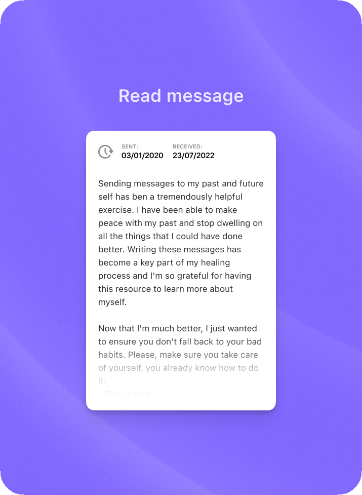
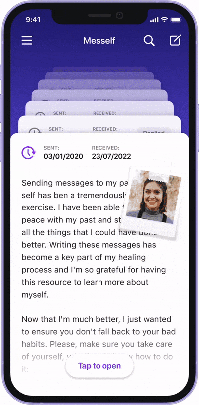
The Home page is where the received messages are stored. Messages are displayed in reverse chronological order (most recent first), sorted by the date in which they were received.
A stack of cards piled up like the Rolodex create the illusion of scrolling messages that have travelled time. With the intention of helping people focus on what is important (their messages), the interface features only the most essential options.

Scrolling messages and discovering product tips on the UI.
A human touch
Messages that have been liked or contain a photograph have stickers representing those statuses on it. This gives the interface a less serious and more cheerful look.
A peek into the future
Scrolling up (towards the future) from the most recent message allows users to peek at the time remaining for the next message to arrive.

6.3 - Browsing and interacting with messages

User flow showcasing the different interactions for navigating between messages.
Messages are opened as a card that floats over the rest of cards. This helps people focus on the content of their messages while providing context to better understand the navigation. Thanks to this, users have two ways to navigate messages: opening and closing them from the home page, or swiping horizontally between them once they are open.
Each message is automatically signed with the user's age at the time of its creation. Therefore, users don't have to calculate their past age when reading messages. By doing this, when users reply to a message, it really looks like a conversation with their past self.

The floating toolbar provides a non-intrusive and easily reachable way to quickly perform common actions. To balance between keeping a minimal design and making the interface more understandable, labels are temporarily displayed when interacting with the toolbar actions.

Toolbar microinteractions.
6.4 - Writing new messages
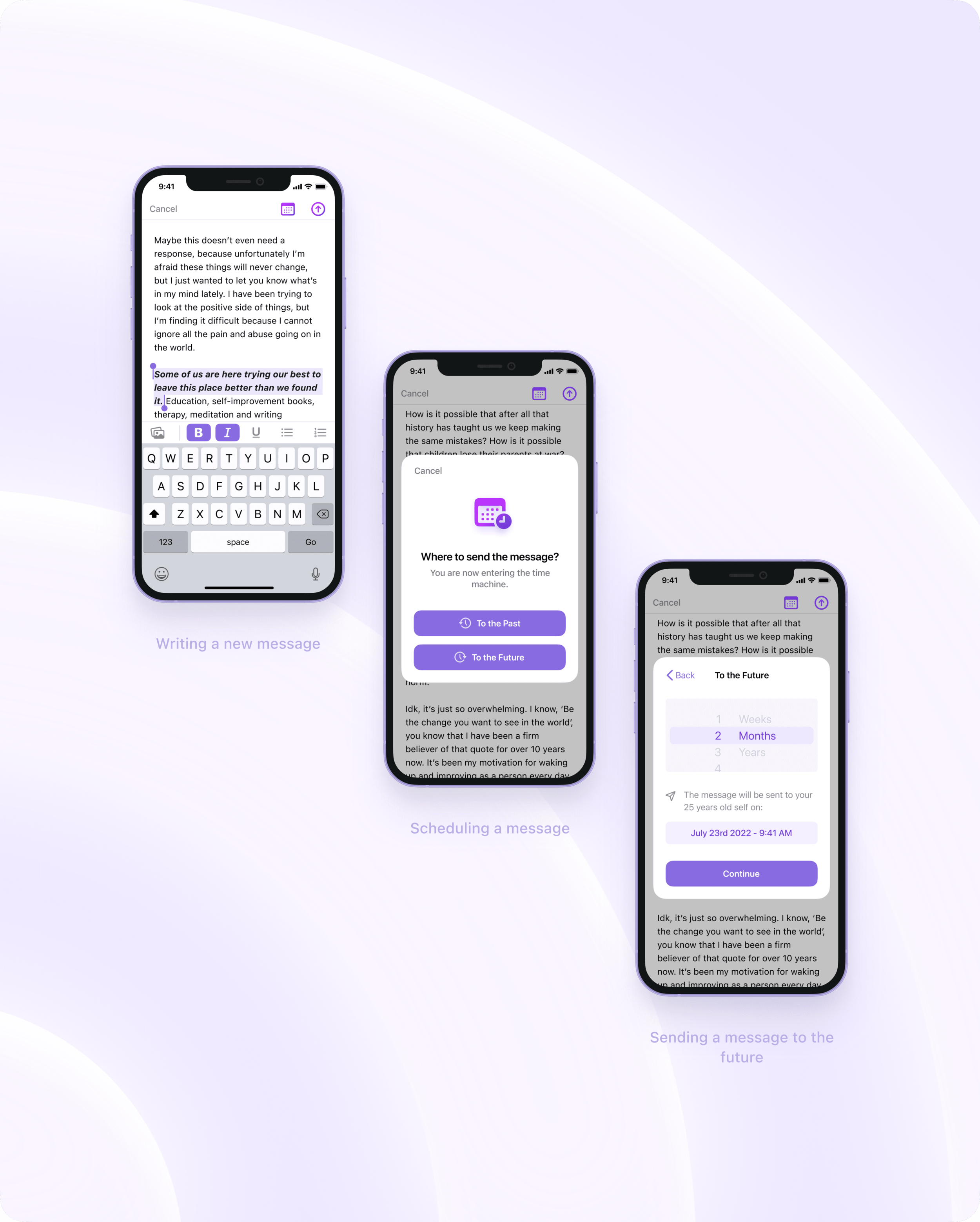

Complete user flow of writing a message.
When the message is ready to send, users can choose whether to send the message to the past or the future. They can pick the date in a quick way by selecting weeks, months or years; or in a more specific way by selecting the exact day and time. Either way, each option affects the other, and the interface shows the date when the message will be delivered, and what age the user had/will have when the message is received.
Feeling stuck? To help people get out of a mental block, the initial ‘Start typing…’ placeholder rotates to a series of prompts displayed after some seconds of inactivity.

(Video speed increased for demonstration purposes).
6.5 - Navigation menu
The app uses a hamburger menu to allow navigation between sections. Besides enabling a navigation system, the menu contains fun basic statistics that users can glance over to find out more about their use of the app.
6.6 - Scheduled messages

The scheduled section hosts all those messages that are sent to the future. To create intrigue and maintain the surprise factor, the content of these messages is not visible until they are received.
6.7 - Filter and search
An app like Mesself presents a series of unique challenges when considering a search functionality. Specifically for search results, the layout of the message cards had to be tweaked so that people can find content inside the messages and even the replies inside of messages.
For the sake of optimization and simplicity, the search and filtering functionalities are merged into the same view, resulting in a powerful and centralized way to find messages.
The search functionality uses a compact card layout to highlight matching text on messages displayed.
6.8 - Settings
One size doesn’t fit all anymore.
With the introduction of iOS 14 in 2020, it became clearer than ever that customization is a crucial aspect for people. Thanks to the native widgets support and customization enhancements, iOS users unleashed their creativity and designed or used custom icon packs for the apps on their Home Screen.
While some see this as a negative thing—being the lack of visual taste the most repeated argument—I see it as an opportunity. It means people are hungry for more options and variety. For this reason, Mesself is packed with plenty of customization options.
For instance, users can choose a different layout for displaying their messages. While the original layout shows large text previews and a more focused experience, users can opt for a more compact layout, one that shows more messages on the screen at the cost of shorter previews.

6.9 - The not so happy path
To keep the case study short and easy to follow, the error messages and empty states have been omitted until now. Nonetheless, they were taken into consideration and below there are some of them.
Empty states
In addition to providing clear visibility of the system status, empty states are a great opportunity to teach users about basic aspects of the products and guide them to move forward.
Preventing human errors
Containing such important memories, deleting messages by mistake would be unfortunate. That’s why Mesself requires a confirmation to delete messages. Additionally, there is a "last chance" feature that gives people some seconds to undo their action in case it wasn't intentional.
7 - Iterations
Throughout the design phase, I made several improvements to the initial ideas brought from previous stages. Iterations have also been omitted until now in favor of an easy-to-follow case study, but they certainly represent a key aspect of the design process.
While it seemed like a good idea in the sketching and wireframing phases, I found that leaving an 'empty card' as a button to write a new message was unnecessary. When users scrolled, the 'card button' would disappear and the only access left would be the one already at the top. In addition to this, it didn't add to the idea of keeping a focused and simplified experience.
The design of the cards that I had initially planned for the home page did not work as expected. In practice, the main card in view was covered by the thumb while scrolling. It was so small that it took up less than the bottom half of the screen, making it easier to focus on the cards in the back than the one in front. After testing with different people, I found that it was better to enlarge the cards and introduce a page-by-page scrolling. It made the experience more enjoyable and created a greater difference between the card layout and the compact layout.

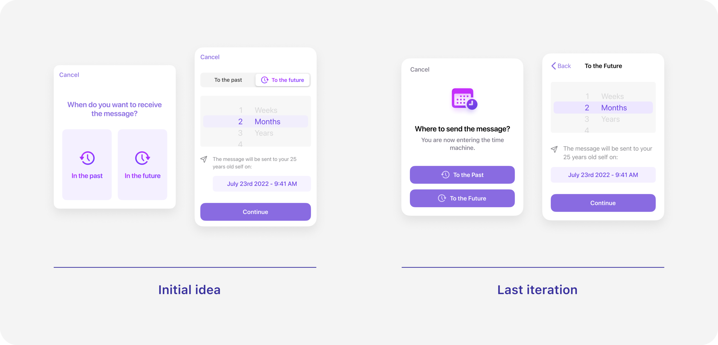
In the beginning, the scheduling window tried to tick many boxes at once and was difficult to understand as a result. The UI was very ambitious, and as a result it presented several challenges. Its simplification made the process easier and faster while simultaneously offering simple and advanced ways to schedule messages.
8 - Afterword
This project was a great reminder to have fun and not being afraid to try new solutions and tools. It helped me consolidate skills I recently acquired and also learn new things. These are the most important takeaways:
Prototyping helps identifying more scenarios than you can initially come up with.
It’s important to create new interactions but also supporting more conventional ways to interact and consume content.
Once the app is defined, think of which settings can be useful for people. Settings are commonly forgotten early in the lifecycle of digital products.
The best way to get comfortable and have more fun writing case studies is writing more case studies.
Special thanks
To Ramsés Cabello, for providing insightful feedback, encouraging me to give my best and proofreading the case study.
To my girlfriend, for helping writing the example messages sent by the fictional character Julie, and for her support and patience throughout this process in which I spent entire days in front of the screen.
Credit
@koy on the Figma community for the iPhone 12 frame that I modified to make it purple.
@templates on the Figma community for the iOS 14 UI kit.
@juanarreguin on the Figma community for the iOS 13 UI kit.
