Designing a Sports Betting Apple Watch App
Date: 2018-2020
This case study outlines the process of redesigning an app for the Apple Watch, and the rationale behind the design decisions that improved what initially seemed complete.
Although I don’t personally engage in or support sports betting or any form of gambling, this is one of the few projects I have permission to share, offering a glimpse into my design process.
About the client
As the nature of this work is confidential, the name of the client, its logo or strategic information won't be disclosed.
The client, who from now on will be referred as 'NICEBET' is a big betting firm that has sponsored major sport teams and invests a significant proportion of their profits in sustainable corporate social responsibility projects.
About sports betting
Since this case study describes the iteration process of a sports betting product, some basic notions of betting jargon will be necessary.
If sports betting sounds new to you, in this 1 minute video you will learn the essential terms.
About the project
An internal company event was about to be celebrated. For the occasion, in addition to a previously requested project, we were be able to propose a brand new project of our choice that met the following criteria:
Based on innovative technology.
Make use of existing resources.
Designed and developed within a tight deadline.
Working in-house for a company proposes a very interesting paradox: by knowing the product, users, limitations and goals very closely, you gain an in-depth understanding that allows you to solve problems more effectively. However, in my experience, new projects are given by the business and you can get trapped in a cycle of solving problems but not thinking about new projects, which can make opportunities like this very challenging.
As a result of an internal process of idea generation, it was decided to go with an Apple Watch app. There were barely competitors with watch apps, so it was an exciting new project that could potentially open the doors to an unexplored market.
My role
Ideation
UX
UI
Copywriting
Challenges
I was already familiar with designing for really small screen resolutions like Opera Mini, an optimized version of the Opera browser that is unbelievably popular amongst feature phone users. However, the challenges that present a screen that is attached to your wrist are significantly different from an interaction point of view.
There were a couple of handicaps:
Little time (which left no chances for user interviews or proper research—although there was previous knowledge about the users).
No previous experience designing apps for Apple Watch.
The bias of being an Apple Watch early adopter.
All things considered, and after thoroughly reviewing the Apple Human Interface Guidelines for WatchOS 4, the journey began.
It wasn’t a first version, it was a concept
Using one post-it for each feature, the entire functionality of the iOS app was portrayed in a whiteboard. It was a useful resource to start discarding functionalities that were not user-centric, considering the peculiarities of the product.
Due to the nature of the Apple Watch, the initial idea was to provide quick access to a reduced number of features that were useful to have at a quick glance.
At the time, many Apple Watch apps were guilty of making the app unusable until the users logged in using their iPhone. We knew we wanted to avoid that.
Trial periods allow users to try a product or service before deciding whether to purchase the full version or not. In similar way, allowing people to play around with the watch app without having to authenticate, can actually be a great motivator for when the time to log in or register inevitably arrives. People will be aware of what they will get in exchange for a bit of their time and effort.
The previous facts helped trimming down the number of features that made sense for the watch app, and after a thorough process, the information architecture was defined.
Once the information architecture was clear, the sketching phase started. The app would use the design language of the iOS app and WatchOS native UI components where possible. The main question that needed to be cleared was how to connect all the sections and present them in a way that made sense for WatchOS users.
The main outcome of the sketching phase was the definition of the navigation system: the sections would be spread across three different pages accessible by horizontally scrolling.
The following video lays out the main user flows of the first version of the design:
Revisiting the project, two years later
After all, that version was never developed. Although the business was excited about the proposal, the development was postponed for internal reasons.
Two WatchOS versions later, the project was proposed for a design review. Although overall the interface seemed to have aged well, there were a couple of shocking realizations related to the experience.
Key learnings from the first version
No matter how many guidelines and best practices you read, there are always opportunities to improve the design:
The 3-click rule has proven to be false for most cases on mobile and desktop interfaces. For a watch app, however, you don't want to keep your arm awkwardly raised for much longer than 30 seconds, and during the tests, we learned that it was the case with the first version of the design.
The main section of the app (Upcoming Games) wouldn't display other sports than just football. Yes, it's the king of sports, but if NICEBET serves players with more than 9 sports, there's no question that some players would be interested in other type of events.
There was so much focus on trying to make a good app within the technical, physical and time constraints, that a fundamental aspect was forgotten: the data. It was assumed that precisely for being a device used during short spans of time, players wouldn’t be interested in adding more than one bet to their Betslips (the check-out process). Taking a look to the usage statistics of the iOS app two years later, it was surprising to see that the vast majority of players were actually playing in a different way.
Considering all the key learnings, the project moved on to the next phase.
The second version
"The only real mistake is the one from which we learn nothing." — Henry Ford
The previous information architecture seemed simple, but in practice, it was not. It was clumsy and required unnecessary steps to perform simple tasks, so it was the starting point for the second version.
The simplification of the information architecture propitiated the creation of a new concept that heavily influenced the user interface. Sections continue to be distributed across three pages, but the order in which they are displayed is totally different. While the previous ordering was rather arbitrary, the new one follows a premise based on the order in which actions are performed by the players within the customer journey.
← PAST – PRESENT – FUTURE →
Although this concept goes unnoticed for the players, in practice it provides far greater convenience and will eventually become the players' mental model when using the app.
Page 1: Bet History
Within the Apple Watch user experience, there are two types of information:
Information you want to interact with (an email, a tweet, a message).
Information you just want to glance and get on with your day (an Apple Pay transaction, a weather alert...).
The Bet History belongs to the group of glanceable information. When players place a bet, all they care about is to see whether they won or not, and in case they won, how much money they earned. They wouldn't want to have to go through multiple screens with their arm raised, as it would have happened with the previous version.
Won bets now display the amount won upfront, and it is displayed with the same color of the 'Won' label, so that players can establish relationships and identify the information instantly.
It was assumed that players would place several bets in the same day, so the date was displayed as a header to group bets. The usage statistics proved that it wasn't the case for the most part, so the date was added inside the cards, properly organized with less visual weight.
The sport icon was a nice addition, but sports fans can instantly relate team names to their corresponding sports. The icon took away space for the bet status labels, and with an app available in different languages, a reasonable use of space becomes vital.
Previously, the type of bet was used as the main identifier of each card, which didn't match the players' mental model. Players don't remember if they placed a single or multi bet, they remember they placed a bet on that Barcelona VS Real Madrid match.
The data showed that when players place multi bets, they can contain many events. The previous version would display all those events in-line with the rest of cards, generating a long scroll that would make hard to discern different cards. The updated version displays the names of the teams in the case of single bets, and a label 'Multi bet' with the number of events in the case of multi bets.
Overall, the labels with more relevance now benefit of a higher contrast, which is a crucial aspect for a device like the Apple Watch.
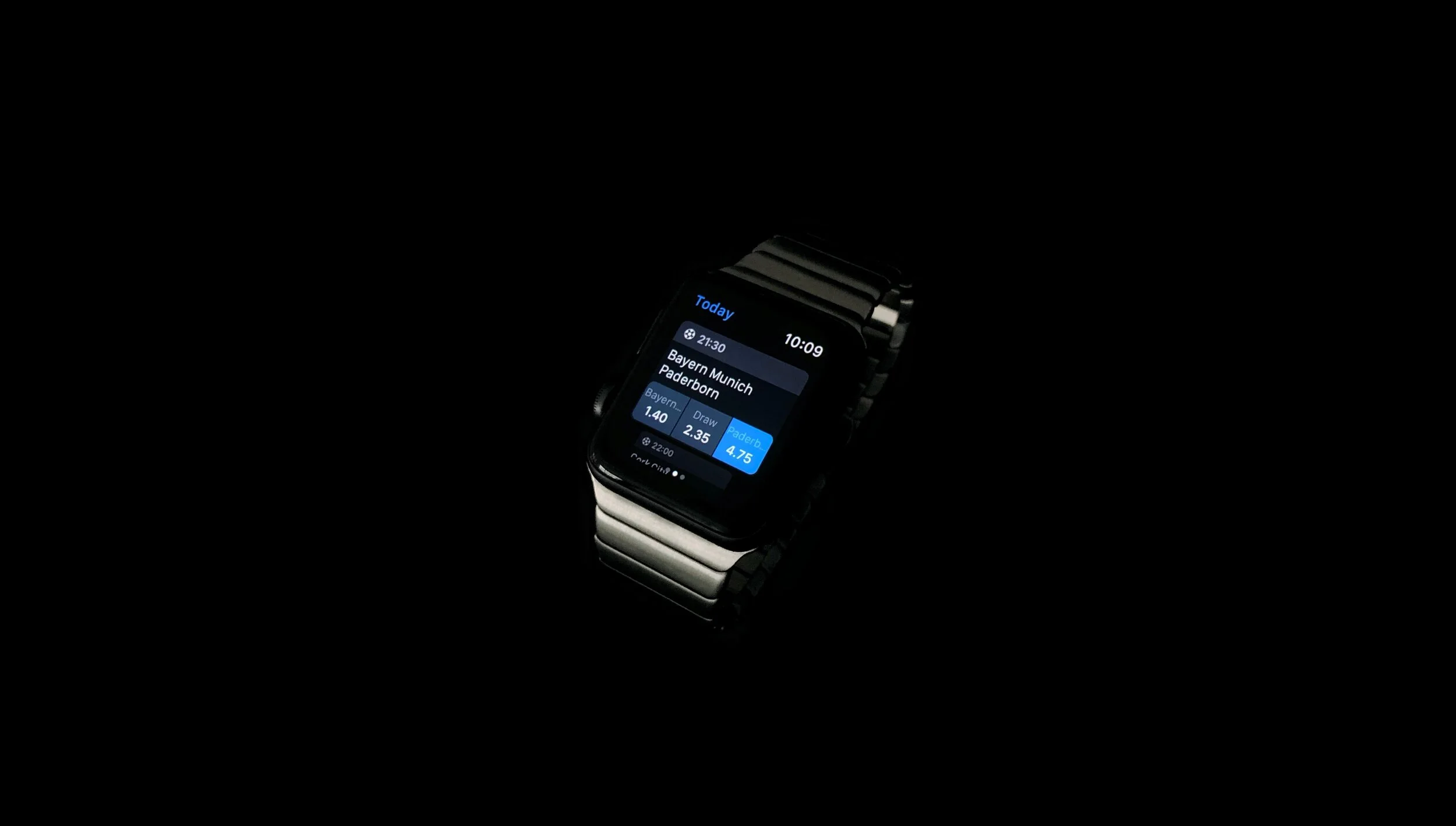
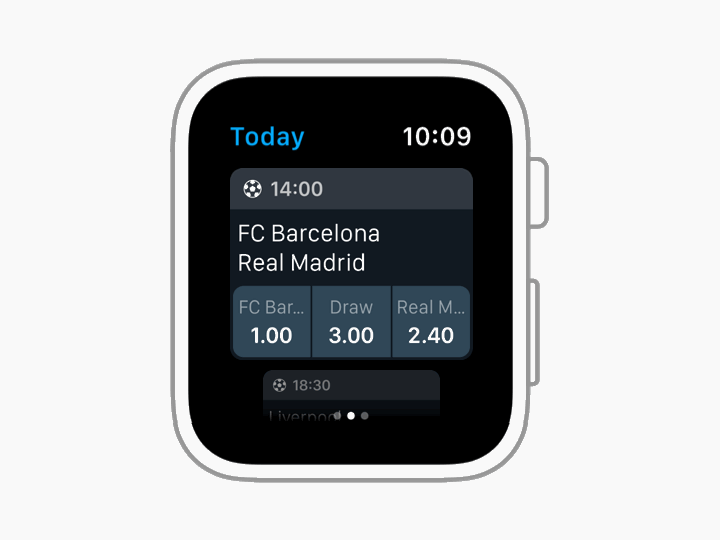
Page 2: Today / Favorites section
On the first version of the design, the main section of the app included a list of events belonging to the current and next day. There were two problems with that decision:
The 'Tomorrow' group of events started right after the list of events for ‘Today’, which was easy to miss while scrolling.
On the website and mobile apps, if players are looking for events that are not for ‘Today’, they have available date, league or country filters to find the events they are interested in. Filters are technically possible to replicate on the watch, but given the physical constrains, their addition would increase complexity—and in consequence, pain points.
In favor of a more streamlined experience, the main section of the app now contains just events for ‘Today’. A better fit for the context of use of the Apple Watch.
The previous user flow made it impossible for players to place multi bets — the most placed type of bet on the iOS app — since it took players to the Betslip (check-out process) as soon as they selected any prediction of an event.
Although the layout was profoundly influenced by the WatchOS 4 Human Interface Guidelines, it didn't match the expectations of the players.
The updated version displays the prediction buttons below the team names on the ‘Today’ section, without requiring players to tap the event to access them, which is more consistent with the iOS app and website design. It also lets players select different predictions before placing the bet from the Betslip, which is now located on a different page; making it possible to place multi bets.
The counterpoint of this improvement is that team names inside the buttons will be truncated in the majority of cases; however, within the sports betting spectrum, this distribution is almost an industry standard, and players have a strong preference for it.
Following the idea of maintaining a streamlined and focused experience on the watch, a page-by-page scrolling system was introduced, assisting all users navigating through the events free of hassle.
As described earlier, in the previous version of the design, the 'Upcoming Games' section only contained football. There is no doubt football is the king of sports, so we opted to set Football as a default sport. However, players now have the option to change the sport from the iOS app settings, which results in a more simplified experience on the watch.
The Favorites section (which used to have its own page) is now located in the same page of the events for ‘Today’. With the improved layout, players can switch between ‘Today’ and Favorites using Force Touch, and the app will remember their latest choice.
The new favorites section benefits from the improvements made for the ‘Today’ section, in terms of the layout of the event cards.
Previously, the favorited teams were highlighted with a brighter and bolder typeface. Now, especially with the introduction of the prediction buttons, the favorited teams required more visual emphasis. In order to achieve that, it was very helpful to take a look at what was done on the iOS app.
Now the favorited teams are highlighted with a yellow color, reminiscent of the star icon that is present on the iOS app. Not only does it make favorite teams stand out more and be instantly identifiable, but reinforces the visual cue selected for the iOS app.
Page 3: Betslip
Some bits of the Betslip revamp have been already described in the previous sections. Adding multi bets is no longer impossible thanks to the reorganization of the information, but with these improvements also came some challenges that will be detailed below.
The new Betslip features bigger and easier to read buttons, but the changes go further than visual amendments.
One of the questions was when to prompt players to log in. As anticipated at the beginning, the idea was to give them room to play with the app, but at some point it will become necessary.
If they are logged out, they can access the Betslip. Players can add bets and adjust the bet amount, but when they try to place a bet, that's when a warning message will prompt them to log in using their iPhone. Once players are logged in, they will be able to place the bet they left in their Betslip.
Another challenge was how to display the type of bet (single or multi). There are more than those two types of bet on the iOS app and the website, but they are not technically possible to bring to the watch app. Therefore, rather than telling players the type of bet they were playing, it seemed more helpful to tell them the number of bets they had in their Betslip (which indirectly also tells them the type of bet). The title of the page was used to include a counter with the number of bets.
Reviewing a project two years later has been a fascinating exercise. It allowed me to see things from another perspective and apply the learnings acquired during these two years.
Digital products are in constant change and I cannot wait to see how the app will evolve. The WatchOS platform will grow, the users' needs will change, and the solutions will need to be adjusted.
Main takeaways
Always use data to challenge your initial hypothesis.
Don't get so caught up trying to perfectly follow guidelines that you forget about the peculiarities of your own platform and users.
It can always be improved, even if it doesn't look like.
Adapting an app to fit in a watch screen is much more than just shrinking the interface. Do not forget about the context of use and the users’ needs.