From validation to evaluation
Shifting a team’s approach to UX research
This case study is a little different. It’s not about designing a new interface or improving user flows. It’s about something less visible but equally important: helping teams rethink how they approach research and decision-making. It’s the type of work that often happens behind the scenes, but can create a ripple effect that leaves a lasting impact on both products and design culture.
When I joined Brainly back in 2021, the company hadn’t yet made its shift from a homework help product to an AI learning companion. It was before the most recent AI boom, and while the product clearly needed change, the focus was on improving what was already built, rather than introducing new features.
It was a period of intense experimentation, with teams working in silos, often producing overlapping or even competing features across different platforms and sections of the product. On top of that, an internal sense of competition led teams to double down on their own solutions, making communication and collaboration even more difficult.
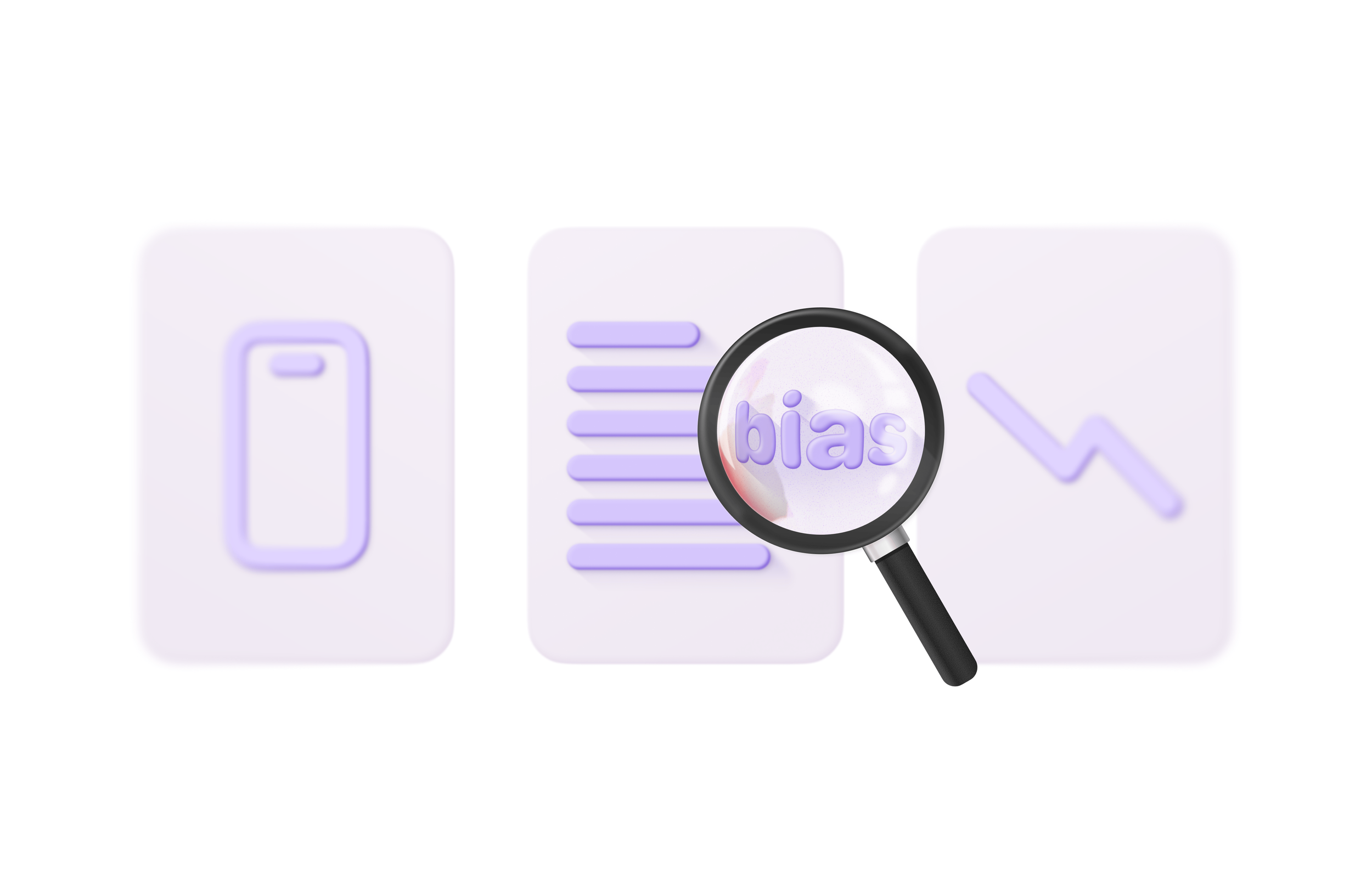
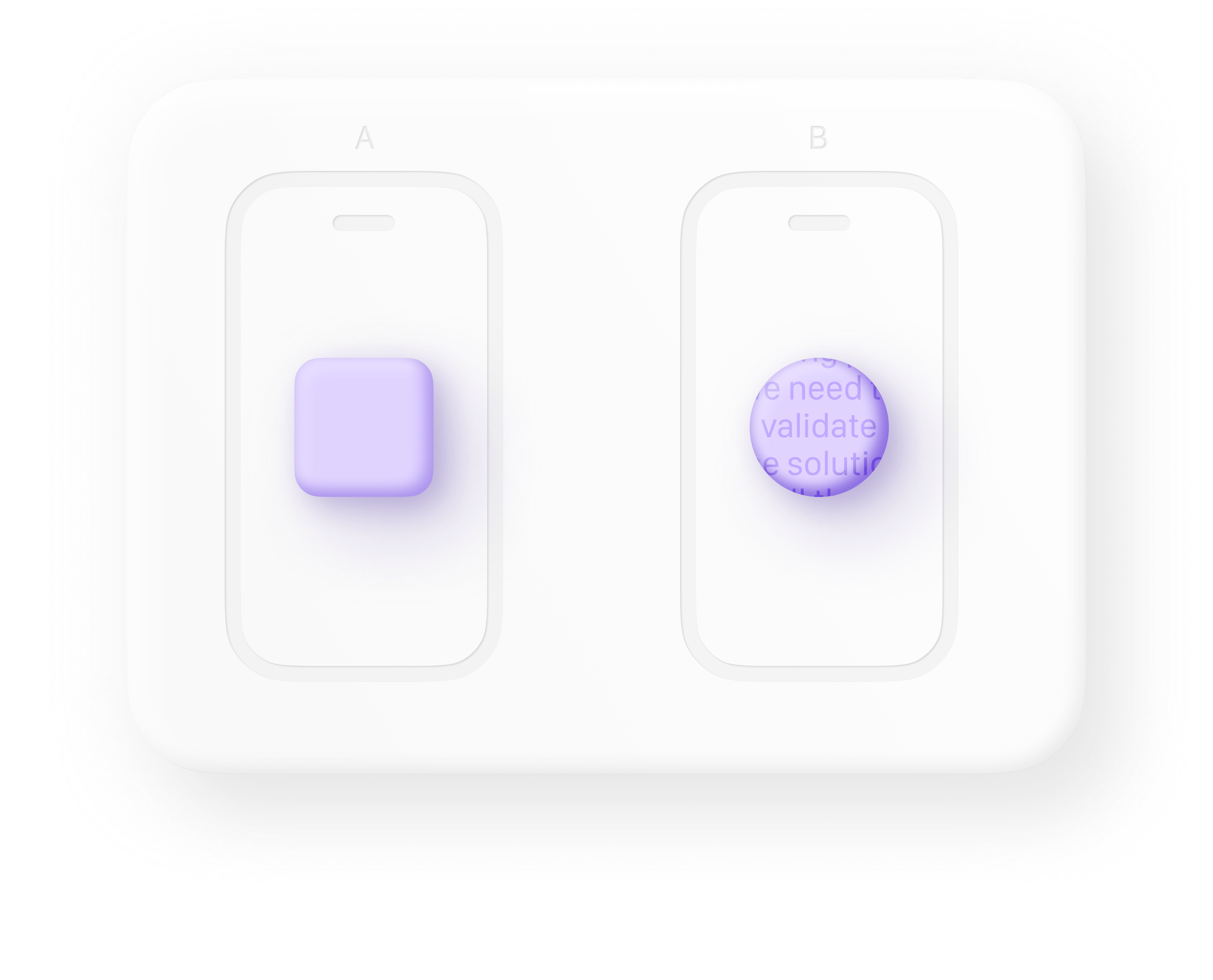
As a result, there was a strong focus on “validating” solutions, which is a mindset I noticed early on reflected in the language teams used daily. Phrases like “we need to validate this”, “we’re running a test to validate the idea”, or “let’s validate this approach first” were common.
I was well aware of the risks about this mindset. When teams approach research or experimentation with the goal of validating a given idea, they can unconsciously seek confirmation of their hypothesis, overlooking contrary evidence or unexpected insights. This confirmation bias is usually the responsible for premature conclusions, ineffective solutions, and missed opportunities for deeper learning.
Given the urgency to move fast (and the fact that I was a new joiner) I didn’t want to slow things down by debating about wording. It wasn’t the right moment for that. Still, I believe in the power of the words we use. After realizing I was not alone in noticing this issue, I teamed up with another designer to intentionally emphasize words like evaluate and explore in our contributions. We hoped others would pick up on it and gradually shift their perspective, but with everyone focused on validating their solutions and the hectic pace of work, our subtle strategy went unnoticed.
Weeks went by, and we kept making responsible use of language. Once things slowed down, we started introducing the conversation about the risks of approaching experiments with a “validation” mindset. Although some people were open and did shift their perspective, the most important contributors didn’t seem to see the importance of it.
This validation mindset was so deeply rooted in the operations that it soon led to a critical misunderstanding. In one experiment, a key engagement metric was misinterpreted, resulting in a restructure of the user flow, affecting how answers were presented to students. The change was implemented under the false belief that it had improved engagement—conveniently aligning with a larger, follow-up project where this redesign also simplified its implementation (a clear example of confirmation bias at work).
It wasn’t until months later, when another data analyst revisited the results as another follow-up project wasn’t performing as expected, that it became clear the test had actually shown the opposite: the redesign had reduced engagement.
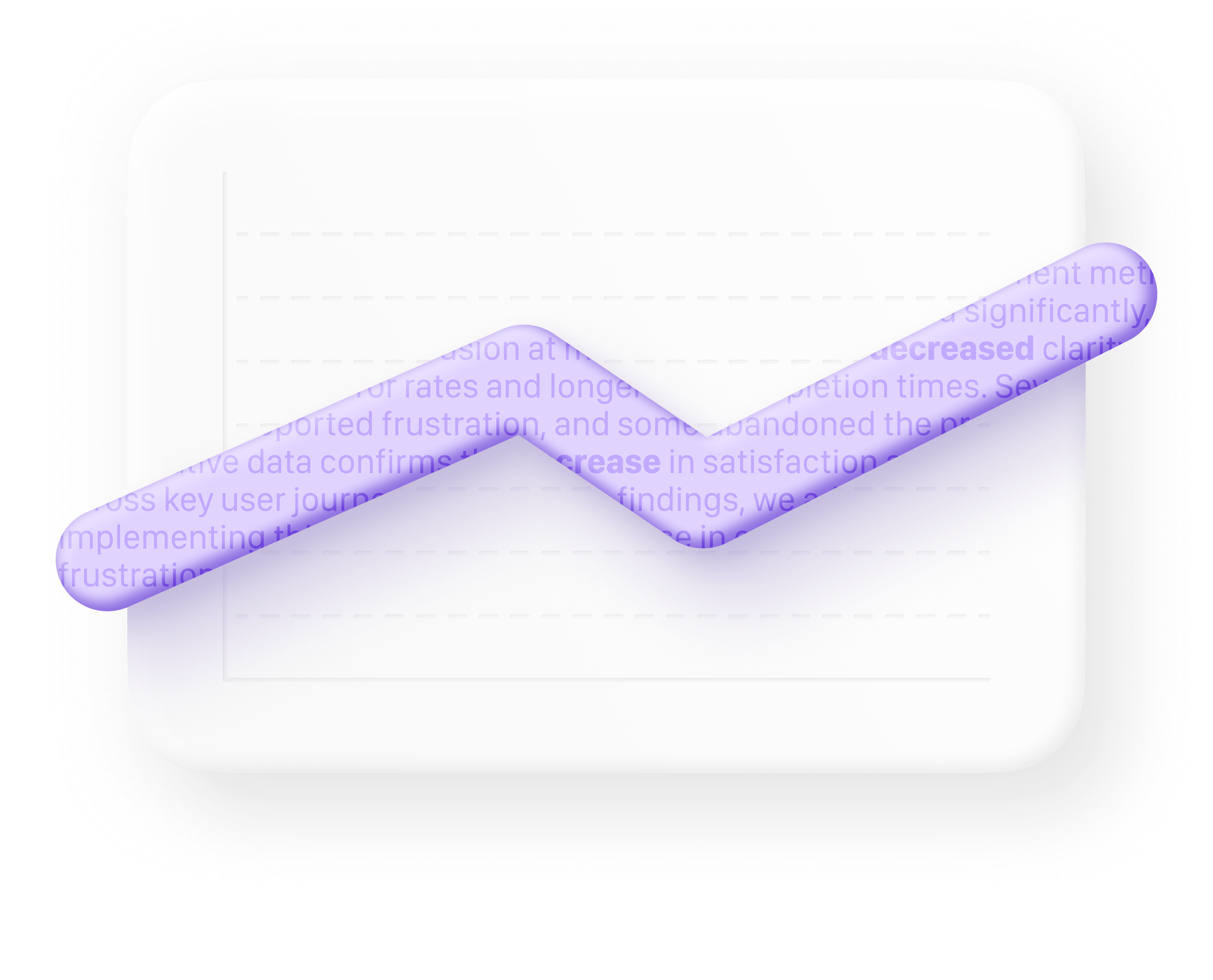
To me, this illustrates how a validation-driven mindset can cause teams to overlook valuable insights, simply because they aren't looking for them. It wasn’t just about moving in the wrong direction, it also meant wasted time, effort, and resources that could have been invested toward more meaningful improvements.
However, before the misinterpreted results came to light, the team assumed that the issue stemmed from a lack of qualitative data. Soon after, they started organizing “user tests”, and when I learned more about what and how they intended to test, I couldn’t help but worry about the future of design culture within the company.
Involving real users is essential, but if not approached rigorously, these efforts can do more harm than good. It could result in false conclusions or reinforcing the notion that “design research doesn’t really work”. That risk felt even greater given how rushed the test plan was.
With non-designers stepping into the space at full speed, and with our UX researchers already beyond their limits, I started thinking about how to help safeguard these efforts without blocking them. I didn’t want to become an obstacle or a gatekeeper, but I also couldn’t sit back and watch well-intentioned teams risk making poor decisions in the name of speed.
That’s when I came up with a simple, scalable solution: a shared document that anyone could access, outlining fundamental research principles and guidelines for running usability tests responsibly. The idea was to count on the UX research team to support me in this process, and to make sure that everyone running any type of research or evaluation technique would be familiar with the guidelines.
Usability Testing Guidelines
The purpose of this document is to share best practices and basic guidelines to ensure usability testing is performed in the most effective and ethical way. By doing this, we ensure we are getting the most out of this technique, and continue to deliver value to our users.
Table of contents:
🧘 Getting into the right mindset
🧠 Leaving bias out of the equation
📝 Before the session
Defining tasks
Being aware of the Hawthorne effect
Reassure participants that they will not be judged
Avoid using the word “Task”
Do not mention a time limit
Being prepared
🧪 During the actual session
📉 After the session
Analyzing the results
Evaluating tasks
What’s a critical error?
What’s a non-critical error?
🔗 Additional resources
🙌🏽 Contributors
🧘 Getting into the right mindset
First of all, it’s important to realize and remember that we are not testing our users or their abilities, we are testing our designs. Therefore, we don’t perform user tests—we conduct usability tests.
🧠 Leaving bias out of the equation
Biases hinder the correct development of usability testing, and they negatively impact the technique’s reliability. Therefore, it’s crucial to learn more about biases and check ourselves and our colleagues to ensure we stay bias-free.
There are many cognitive biases that can negatively affect the quality of our usability tests. Cognitive biases can be introduced at different points of a test by different members of the team:
When defining tasks
While users are performing the task
While evaluating the task
When documenting the insights from the task
Please, get familiar with the most popular and common biases and read about how to avoid or minimize their effects.
Most popular biases:
Confirmation bias
Framing bias
Polarization bias
Culture bias
🔗 Learn more at:
Common Types of Design Bias & How to Overcome Them | Adam Fard Studio
Types of User Research Bias and How to Avoid It in Your UX Design
📝 Before the session
Defining tasks
Tasks are one of the most important aspects about the test; however, creating tasks is not limited to the scenarios that are given to users. First we need to define a number of things.
We need to define:
You can click each block to expand and learn more.
-
To ensure the study has a meaningful impact and provides useful insights for the particular problem at hand, we need to start with the what. This way, everyone is on the same page and we ensure clarity throughout the process.
-
“First, you and your team should identify participant criteria for your study. Think about both the demographics of your target audience and its goals as they use your products. (For a thorough breakdown of this process, check out our free report How to Recruit Participants for Usability Studies.) These criteria will determine your recruitment strategy and your screener.
If you use automated-recruiting platforms, be careful about overly restricting your survey by having extraneous elimination criteria.
For example, say you were concerned about professional testers and you included an exclusionary question like “When did you last participate in a research study?” You may exclude more participants than necessary, like second-time participants who just happened to participate in a completely different type of study that same month.
In a similar vein, in an attempt to recruit marketing professionals, you might choose to accept only individuals who select Advertising and Marketing as their industry. However, marketing professionals are not exclusive to advertising and marketing agencies and, more often than not, they do marketing functions within nonmarketing organizations (like grocery or apparel stores). Thus, it would be more productive to accept people from multiple industries who have the term “marketing” within job titles or descriptions.”
🔗 Learn more: Recruiting and Screening Candidates for User Research Projects
-
According to User Experience grandparents Jakob Nielsen and Don Norman, 5 is the magic number. In some instances, it could be useful to recruit up to 8 users, but definitely never more than 15.
🔗 Learn more: How Many Test Users in a Usability Study?
-
The greater the number of tasks, the greater the students’ fatigue. As a rule of thumb, try to keep them under 5.
This will partly depend on the time each task takes to complete.
-
When it comes to each task, it’s important to set a time limit. Because they will be in a controlled environment, users may take a lot of time trying different routes until they find a way to achieve their goal.
However, in real life, if they become frustrated with a product they may simple give up and move on.
When setting a time limit, be realistic. Keep in mind things like:
Application/Website or prototype load times
Age of the students or school level (which can give us a clue of their abilities with technology, and how to talk to them)
Whether they are familiar with the product or not
Students familiar with Brainly or platforms alike may already have a mental model and be able to quickly navigate and understand topics.
Students not familiar with Brainly or platforms alike may need extra time to understand concepts and navigate through the product.
ℹ️ Tip: you can use a stopwatch and try to count the time a colleague (not the designer of the functionality) takes to complete the task, and multiply the time by 2.
⚠️ Important: Students should never be informed of a time limit or be stopped if they exceed it. This will be used as an internal metric for us to evaluate if there might be critical usability errors.
As for the timing of the entire session, this will depend on the number of tasks and their nature, as well as the age of the participant and whether they are already familiar with the product or not. Normally, usability testing sessions take less than 45 minutes.
-
Should the prototype start on Google, or inside Brainly? Should it be inside the main Brainly tab/page or inside a specific tab? Depending on our goal and what we need to test, the starting point will be one or another.
The starting point should be defined not only internally, but also reflected on the task description for users. Students need to have context about where they are within the journey and why they are there.
-
“Once you’ve figured out what the users' goals are, you need to formulate task scenarios that are appropriate for usability testing”.
Scenarios need to be based on a real and concrete user needs, in a specific context.
❌ Poorly defined scenario
Please open the Maths Bianchini book and go to exercise 2 of the page 14 and see if you can find the button to view the final answer.
✅ Well defined scenario
Imagine you are doing your homework for tomorrow. After being stuck for 20 minutes in the exercise 2 of the page 14 of your Maths Bianchini 9 textbook, you decide to seek some help. You open the Textbooks section of the Brainly app and try to verify if your final answer is correct.
🔗 Learn more: Task Scenarios for Usability Testing
-
Below in the document we propose a simple framework for assessing the severity of usability errors found.
-
As we anticipated in the “Leaving bias out of the equation” part, having multiple people involved in the usability test ensures biases are kept to a minimum, and that the result of the study is reliable.
The evaluation should be performed by Product Designers, Interaction Designers or User Researchers (and ideally the combination of at least two of them) in the most scientific way, sticking to facts and providing transparency for the rest of the team.
Tasks will be evaluated based on a mix of:
Task completion
Time on Task (ToT)
Students’ satisfaction rate
Severity of usability problems found
We need to ensure that our scenarios:
Describe a situation that makes sense for students, given their age and location, from the point of view of their interests and experience. We need to put ourselves in their shoes.
Are clearly explained, written in plain English and using the students’ natural language instead of our tech/design terminology.
Say design instead of user interface
Say button instead of call to action
Say prototype instead of mock-up
Being aware of the Hawthorne effect
“The Hawthorne effect refers to a type of reactivity in which individuals modify an aspect of their behavior in response to their awareness of being observed.”
By conducting remote usability tests, we are already slightly minimizing the Hawthorne effect, but there are still a number of things that we should take into account:
Reassure participants that they will not be judged
We are just checking how to improve our design, and it’s important that students know this. However, we should not give away too many details and make participants aware of our specific expectations for the test.
Introduction Example for Participants
“With this session we want to discover things to improve in our design, to make the app/website easier to use for people like you.
We are not judging you in any way—actually, you are helping us judge the design so we can make it better.”
Avoid using the word “Task”
Words like “Task” can have a negative connotation, especially in the minds of young students. Did you know that the second synonym for the word “Task” in the thesaurus is “burden”? Try to use words like cards, scenarios or activities instead, and watch out for other words with negative connotations.
Do not mention a time limit
Informing users about a time brings into play three negative effects:
They will feel pressured and may think that we are judging them.
We will introduce a factor that will alter the participants’ behavior.
Participants will be distracted thinking about how much time they have left.
If users ask about it, we should tell them they don’t have to worry about it.
Being prepared
Some people may naturally drop off or suddenly not be available for the session. If possible, send them a reminder 24 hours before, or have some back-up participants just in case.
🧪 During the actual session
After introducing users to the test and reassuring them that they will not be judged, they will be explained how to proceed with the session.
We will ask them to read out loud the activities cards. If they have questions, we can clarify them without introducing new details.
We will ask them to think out loud, and if needed, we will remind them throughout the session.
After each task, we will ask users to inform us about their satisfaction rate with the task, and if needed, ask them to clarify a specific action, avoiding to make them feel judged.
We will note the time spent on each task and whether the tasks are completed or not.
📉 After the session
Analyzing the results
As anticipated before, this is a key moment where we need to be mindful of cognitive biases. Try to be objective and involve other designers in the session to reduce bias.
As part of the analysis process, it’s vital to distinguish the different units of students’ reactions:
Operations: 0,1 seconds → Unconscious and automatic reactions.
Actions: 0,1 - 10 seconds → Conscious.
Tasks: Many actions performed in order and following a goal.
Students are aware of actions and tasks, not operations. We need to remember this to judge whether a reaction was intuitive or meditated.
Evaluating tasks
Tasks will be evaluated using a simple scale:
Critical error: task not completed
Non-critical error: task completed
Very mild error
Mild error
What’s a critical error?
Anything that prevents users from successfully completing the task. This includes things like:
Participants think they are done when in reality they haven’t finished the task according to our criteria.
Participants don’t know how to proceed and are stuck in their journey.
What’s a non-critical error?
Something that impedes users from smoothly going through a completed task. They may take some time to make progress or may go back and forth, lost in their journey; however, they can recover by themselves and finish the task.
🔗 Additional resources:
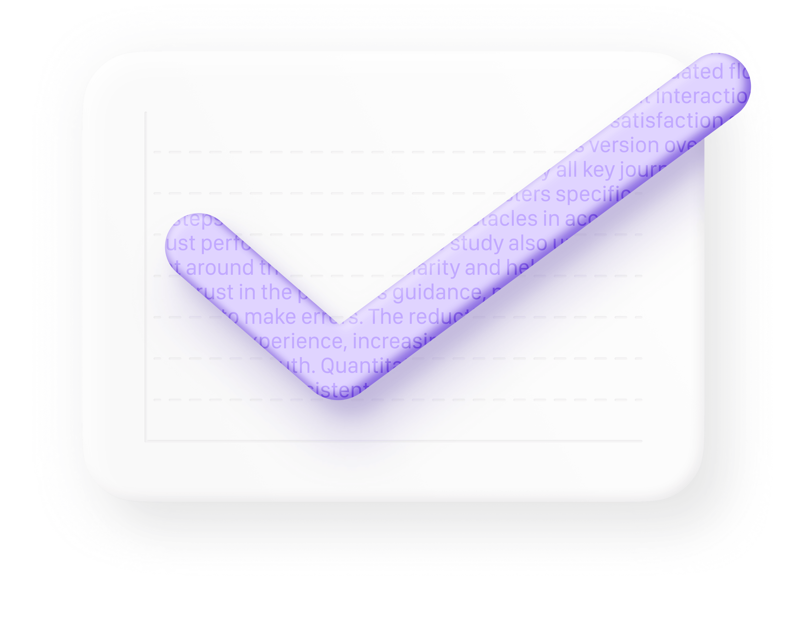
As you can see, the document is both practical and educational. It’s designed to progressively introduce more depth while still allowing people to skim through and grasp the basics. The result is more than just a guide on how to conduct usability tests; it’s a reflection of what UX research actually is: not simply showing up to another meeting and asking some questions, but a deliberate, methodical process grounded in behavioral science, which demands rigor and adherence to ethical standards.
I was lucky to have colleagues who were open and supportive of this effort, and soon, I started seeing signs of change.
What was the outcome?
The fact that I put the time and effort into creating something actionable and useful sparked curiosity, even among people who hadn’t seen the value in UX research before. The document was added to a central Confluence space and started circulating organically among teams conducting research. It certainly didn’t go unnoticed.
Designers who had been frustrated by the way research was being handled now felt more encouraged and inspired to advocate for good practices, and they frequently mentioned how helpful this document was.
People with little to no previous research experience found it approachable, and started applying some of its suggestions to improve how they approached research.
Over time, I also noticed a subtle shift in the everyday language people used. Words like “validate” became a thing of the past, and I began hearing more mentions of biases, with people actively making an effort to avoid them.
Although it wasn’t an overnight evolution, and it definitely wasn’t all my doing, research gained more importance. Fast forward, and the company was strategically using research, taking a central role in future projects, leading to solutions that responded to real user needs.
Petting the elephant in the room
I would be lying if I said I didn’t see the elephant in the room: why were inexperienced roles conducting UX research? I believe that ideally, UX researchers should be the ones leading research, and if that wasn’t possible due to limited capacity, there should be at least a product designer involved in the process. But real life often looks very different from the ideal we learn about.
I could have simply pointed out how wrong everything was, or how far from theory things were, but the point is that someone already did that, and it didn’t work. Trying harder is not going to change anything. To their eyes, that would probably have made me an obstacle, and it would have achieved nothing. Experience tells me that this type of situation requires creative, uncommon solutions, even if they don’t look glamorous.
This case study is not about a document; it’s about adapting to suboptimal situations with resources that meet people where they are, safeguarding the design process and fostering collaboration, showing the value of design without gatekeeping, and empowering others to do the same along the way.
On that note, I would be absolutely delusional if I said this was all my doing. This was a team effort, and the outcome was achieved thanks to the ripple effect of all the people who were open to change their attitude, lend a hand, or fight for the cause. I’m aware that it was the collective effort that took us there, and I’m grateful to have contributed something that made a difference.