The opportunity in the overlooked
Redesigning Brainly’s student profile
Senior Interaction Product Designer · Mobile Apps · +30% Engagement
Overview
I led the redesign of Brainly’s mobile profile experience, increasing engagement by 30% and reframing its strategic value inside the company. What had been an ignored, inconsistent, and outdated corner of the app became a clear driver of user interaction and monetization moving forward.
Context
Brainly is a global AI-powered education platform with over 15 million daily active users. It connects students, parents, and teachers in a collaborative learning community.
Originally built as a peer-to-peer homework help site, Brainly evolved into an AI Learning Companion after rapid growth during the COVID-19 pandemic, expanding its tools well beyond Q&A.
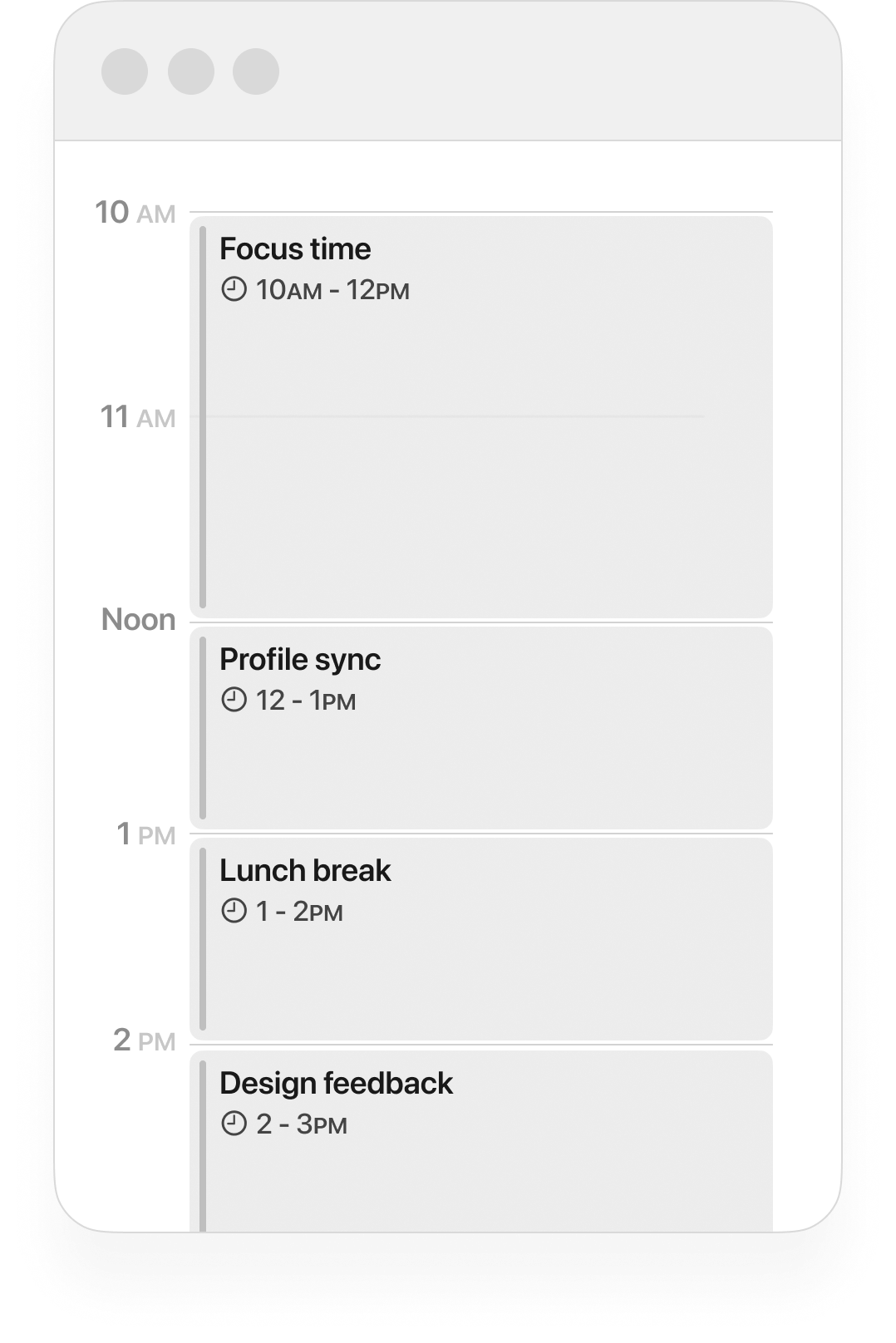
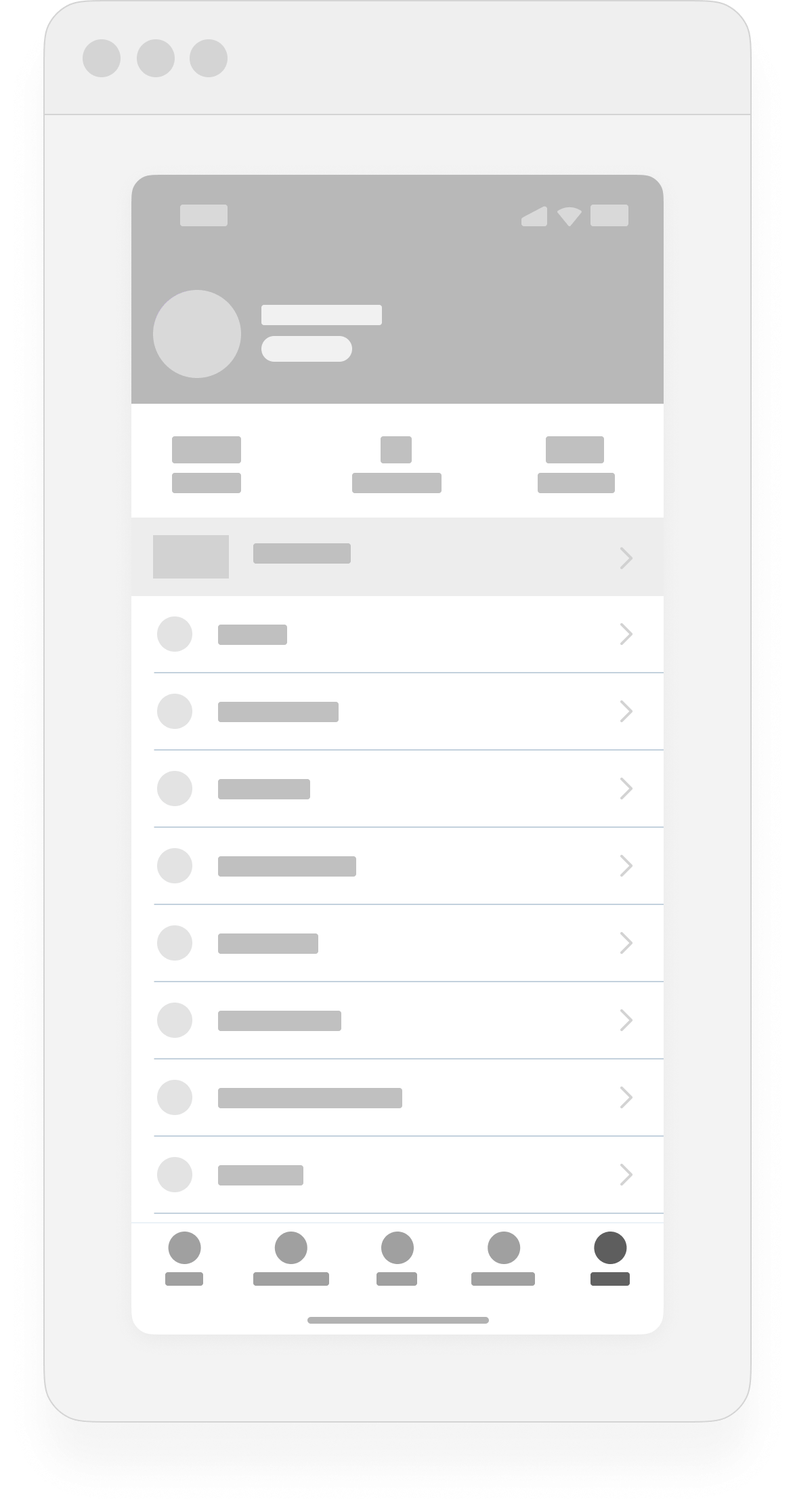
I worked on the mobile apps team, focusing on the iOS and Android experience for our global user base. This case study centers on the profile section, one of the few persistent touch points for both free and premium users, and a key opportunity to improve engagement and monetization.
Challenge
The profile section was meant to deliver the basics of a social platform: communication, content management, and personalization. Instead, it became a neglected corner of the product, as a result of Brainly’s rapid growth.
Inconsistent and outdated across platforms:
Visuals: off-brand, inaccessible, and cluttered.
Functionality: unclear information architecture, confusing navigation, and missing features.
Parity: iOS and Android offered different experiences, with iOS being “designed by developers” and no UI files at all.
This hurt both students and teams:
Students got a poor first impression and no reason to return (as confirmed by the metrics).
Monetization opportunities were buried deep in an uninspiring space.
Designers and PMs had to constantly check with engineers to confirm which features existed on each platform.
Everyone agreed it was just bad, but with bigger priorities on the roadmap, it was repeatedly postponed. Several redesign proposals had been praised, then quietly parked and forgotten.
Constraints
The core challenge wasn’t the design work itself, but proving the business value of fixing it.
For years, stakeholders saw the profile as low-impact, not worth diverting resources from higher-priority initiatives.
Multiple proposals had been abandoned despite internal consensus on the problems.
The profile’s flaws created ongoing design and technical debt, but without a clear ROI, it stayed off the roadmap.
The risk was that even a small update could be dismissed as “nice-to-have” and deprioritized again.
The opportunity
At the time, Brainly was preparing for a monetization strategy revamp. The profile’s underperforming subscription banner became the perfect opening to justify an update. Depending on the student’s subscription status, it showed one of three variants:
Poor placement, weak design, and unclear UX copy turned this banner into an opportunity for change.
The banner’s poor performance wasn’t just about its weak design: it was buried inside a confusing, inconsistent, and outdated profile section that gave students no reason to engage. Updating the banner alone wouldn’t have solved the problem; we needed to fix the foundation first.
Challenges like this are often multi-dimensional, and stakeholders could have suggested updating only the banner. I prepared clear arguments to explain why that wouldn’t work.
If stakeholders asked to fix only the banner…
-
We could simply update the copy, even improve the styling, but the banner would still be placed inside a section that doesn’t feel inviting. How can we convince students to pay for a premium experience, if the very place promoting it fails to meet our own standard of quality?
-
Say we fixed the banner. Do we expect more people to interact with a nicer banner inside an equally neglected section? The profile experience is confusing and uninviting. It’s sub-par not only compared to competitors, but to the expectations students have from any modern tech product. Improving the surrounding section gives the banner a better chance to actually perform.
-
At some point, as part of the new branding rollout, we’ll need to update the profile. The current structure makes it nearly impossible to introduce the new branding in a way that feels natural or effective. By investing in this update now, we’re also making sure the section is ready for the rebrand with minimal extra effort later on—both on the design and development fronts.
-
Updating the banner alone doesn’t improve the profile experience for users, and it does nothing to ease the development experience internally either.
The broken information architecture inside the profile, and the rushed way it’s built, means that any change always requires extra effort, if only to verify which features are on Android and which on iOS. Investing a little effort on this now will go a long way, reducing friction and time in the future.
-
We’re talking about a banner because it’s the only resource we are working with, but this section holds potential for so much more.
This is naturally a prime location for personalization, being the only place where students can see their progress and feel a sense of ownership.
The profile could be better integrated with the latest features we have introduced, which are currently siloed in hidden corners of the product.
A better profile sets the ground for a gamification revamp. What we currently have is outdated and ineffective, but a fresher profile section could better support rethinking how we motivate students with points, badges, or challenges.
And perhaps more importantly: if the profile was more relevant, students would have a reason to engage more, which could uplift our retention metrics as well.
With monetization, UX copy, and engineering on board, we confirmed the redesign was low-hanging fruit with high business potential. Before setting final goals, we needed to understand the full scope of the problem. This alignment gave us the momentum to move into a detailed audit of the profile, mapping inconsistencies, and identifying the core issues that would shape our redesign objectives.
Audit & Analysis
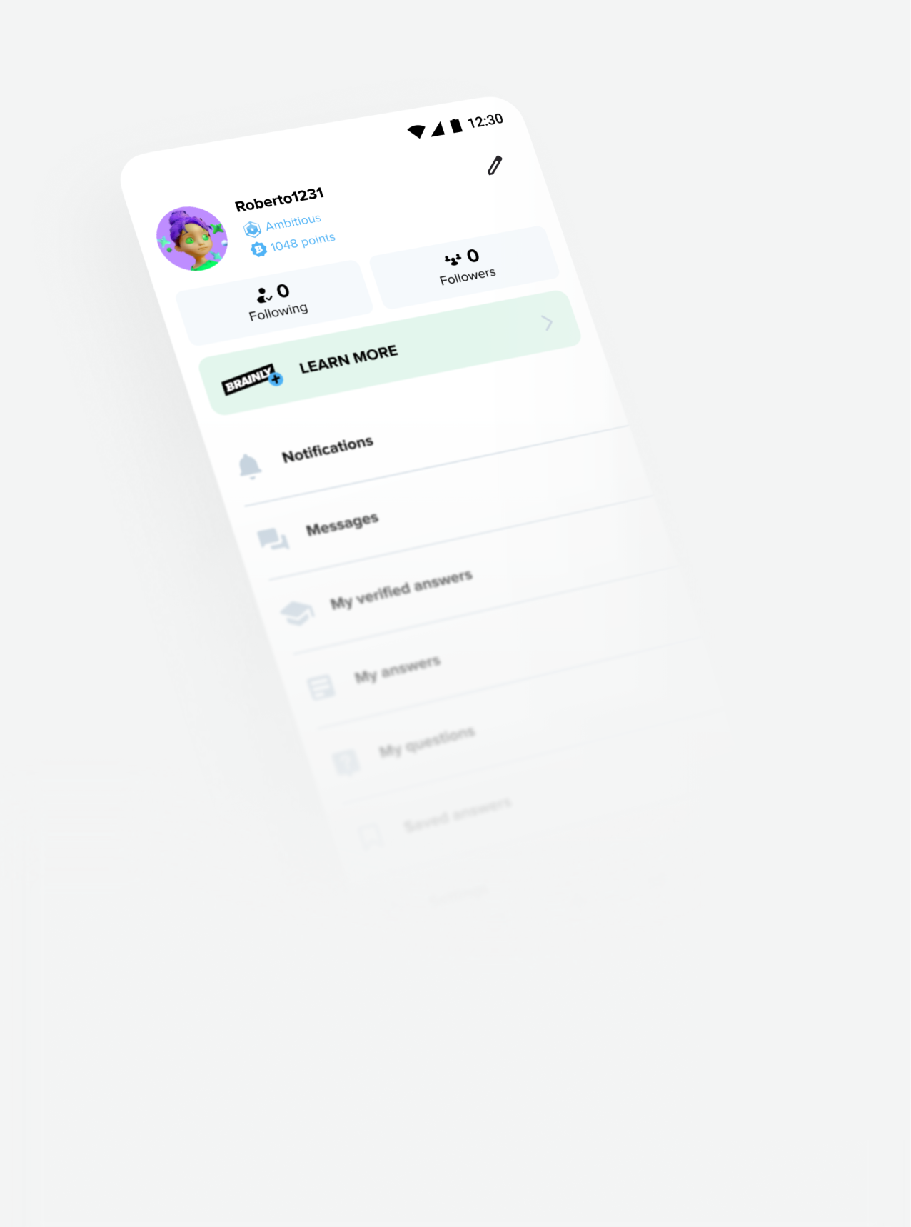
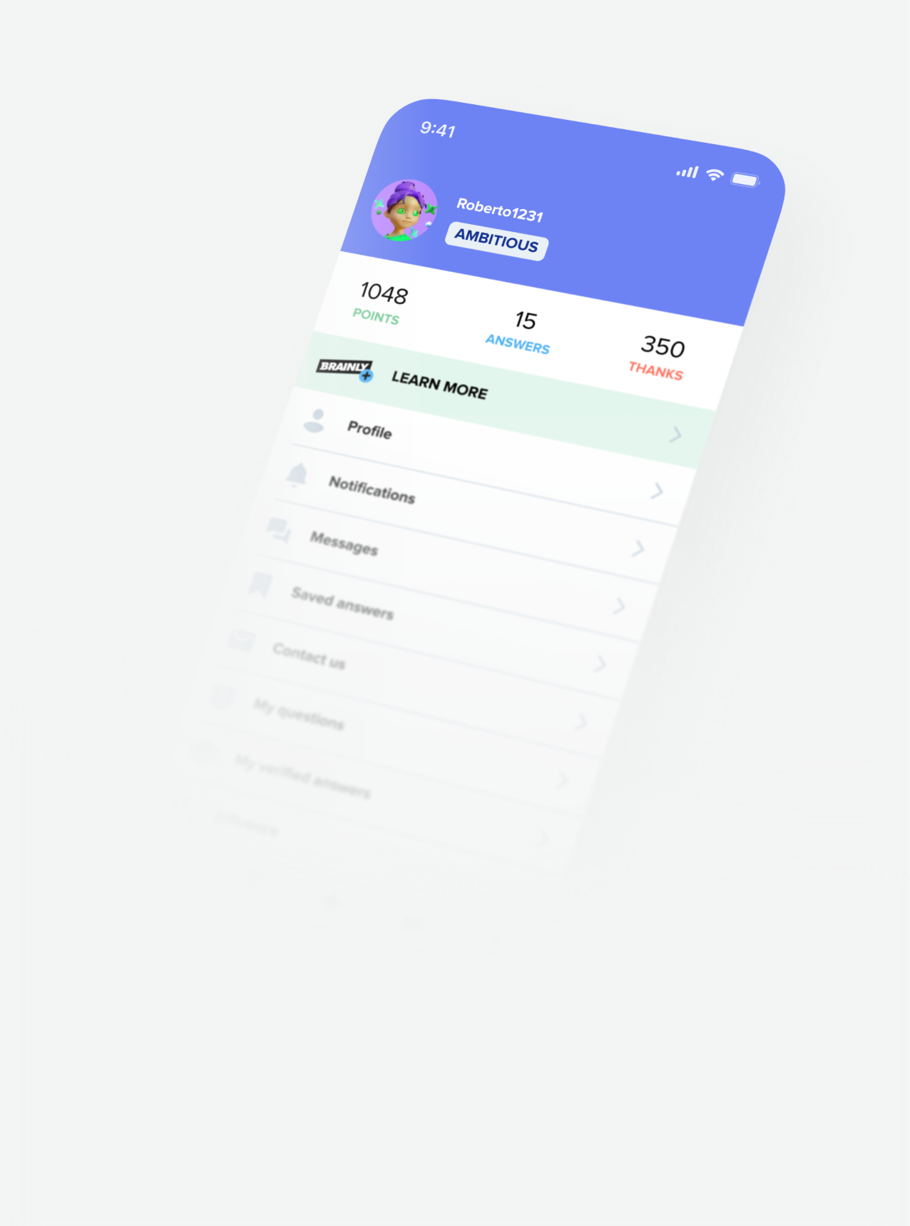
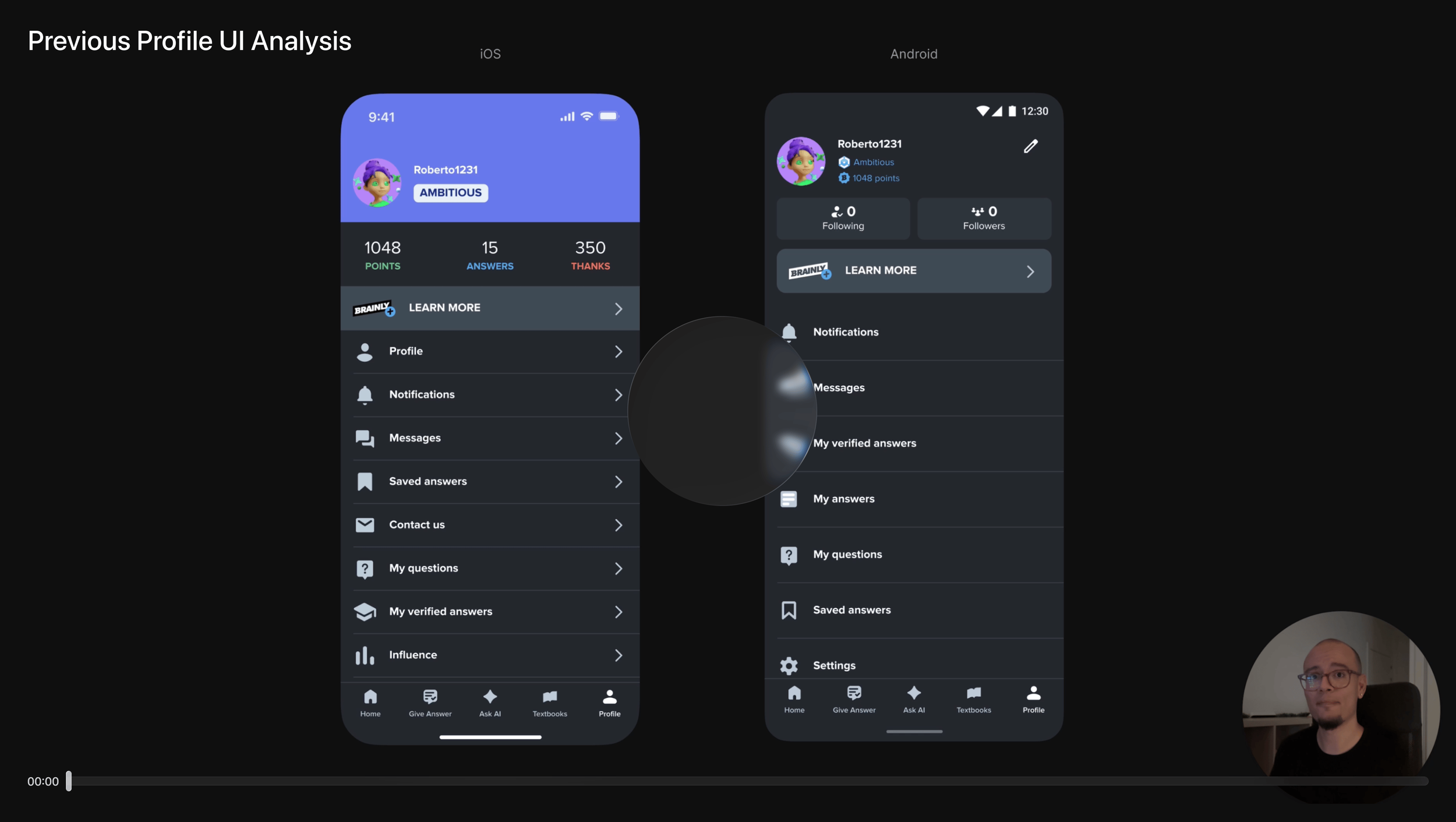
Given the lack of feature parity between iOS and Android, my first priority was to understand the full picture. This meant going beyond surface-level differences to uncover structural gaps.
Below is a visual comparison of the main profile screen on iOS and Android, along with a quick table highlighting the most notable differences. This is a simplified snapshot, meant to illustrate the scope before moving into deeper analysis.
| Feature | iOS | Android |
|---|---|---|
| Avatar and username | ✔ | ✔ |
| Rank label | ✔ (label component) | ✔ (icon + text) |
| Background header | ✔ | ✘ |
| Edit profile button | ✘ | ✔ |
| Points | ✔ (in summary) | ✔ (below rank, icon + text) |
| Answers given | ✔ | ✘ |
| Thanks given | ✔ | ✘ |
| Subscription banner | ✔ (full width) | ✔ (padded) |
| Following / followers | ✘ | ✔ |
| Profile sub-section | ✔ | ✘ |
| Notifications | ✔ | ✔ |
| Messages | ✔ | ✔ |
| Verified answers | ✔ | ✔ (different position) |
| My answers | ✘ | ✔ |
| Saved answers | ✔ | ✔ (different position) |
| Contact us | ✔ | ✘ |
| My questions | ✔ | ✔ |
| Influence | ✔ | ✘ |
| Settings | ✔ | ✔ |
| Next rank section | ✔ | ✔ (with differences) |
| Top subjects | ✔ | ✘ |
Thanks to the audit, I got a better understanding of the current state of the implementation. For example, I found a major dead-end when visiting another student’s profile. It opened a drawer-style view with no obvious way to close it. On top of that, the “Top subjects” section displayed the same title (“YOU’RE THE BEST IN”) even when viewing someone else’s profile, providing a confusing experience.
I also noticed there was no visual indicator of subscription status on a subscriber’s profile. On other social platforms, similar badges help make premium accounts more visible and aspirational. While this wasn’t part of the immediate scope, it highlighted another area where the profile could better support monetization goals.
While I reviewed these findings, our data analysts confirmed what we suspected: the profile section saw very little traffic.
The real challenge was discovering the why. The implementation was so old that no one could explain the decisions behind it. There was no documentation, and the only “design files” were a chaotic mix of masked screenshots, components floating on top of other screenshots, and UI fragments stacked like a digital junk drawer. A clear sign the work had been rushed.
With no reliable source of truth, I chose to move forward based on today’s needs, designing for clarity, consistency and relevance, rather than preserving outdated decisions with no rationale.
Defining goals
Before jumping into visuals, my PM and I aligned on a clear definition of success. Without it, we risked falling into a vague “let’s just improve it” mindset (which could mean something different to everyone).
Our goal wasn’t simply to “make the profile better,” but to make it relevant; a space students would actually want to visit because it was useful. That meant asking a bigger question: What role should the profile play in Brainly today?
From there, we defined success in four parts:
Improved engagement: We had to be realistic—this is a profile section, not a standalone product. Any measurable, consistent increase (beyond the novelty effect) would be a win.
Increased conversion: As a result of the increased engagement and better leveraged monetization opportunities.
Consistency across Android and iOS: Close the iOS/Android gap by removing redundant or legacy elements and introducing a unified structure.
Reduced tech and design debt: Replace outdated patterns with a scalable, maintainable design that’s easier for teams to build on.
Exploration & Design Decisions
With the full picture in place and our goals defined, I moved into the design phase, starting with information architecture, given the scale of the structural issues.
Because these changes would directly impact delivery, I worked closely with my PM to define what could realistically ship in the MVP versus later iterations. This alignment gave us both clarity: I could design for scalability, and she could plan timelines with confidence.
The content inventory from the initial analysis turned out to be a valuable exercise. It gave me a clearer view of the current state and helped me spot opportunities to reorganize the architecture more intentionally. Collaborating closely with my PM at this stage made alignment fast and efficient: we were able to agree on what to remove, what to keep, and what new elements to introduce from siloed parts of the product.
But hey,
I’d love to walk you through it in more detail.
Do you have time for a quick call?
Happy to keep typing if that’s easier for you, but I believe a quick chat will make it simpler to explain everything clearly and align more smoothly.
Wireframing
This redesign was structurally straightforward, but I still explored multiple patterns before committing. Working in low fidelity let me move fast and think clearly without copy or visuals getting in the way. With a tight deadline, I focused on structures that would scale and ship.
My experience at Brainly taught me that students value speed, clarity, and familiarity. Radical changes risk confusion and make key info harder to find, so I aimed to improve usability without losing patterns they already knew.
I narrowed down to two options:
Scroll-Based Layout
Vertical list of profile sections; immediate, intuitive, and flexible for varying content. Familiar for students using Brainly, relying on a natural behavior to avoid requiring any additional effort.
Tabbed Layout
Provides a cleaner look, but adds friction with extra horizontal swipes or taps on the tabs; not ideal for quick scanning, and felt unnecessary for the information density we were dealing with.
I chose the scroll-based layout because it balanced familiarity with usability gains, ensuring a quick development while solving known pain points.
A key decision was moving Notifications and Settings outside the main navigation list. This had three benefits:
Decongested the main list so students only see activity-based sections there.
Reduced decision time for items on the main list (Hick’s Law).
Placed frequent actions near the corners of the screen, leveraging and reinforcing muscle memory.
With the wireframes in place, I moved into UI, where I would focus on building a system that was easy for developers to implement and maintain, and intuitive for students to navigate.
I prioritized reusable components, consistent patterns, and simple layouts to reduce short-term engineering effort while keeping the design scalable for future iterations.
Here’s where we landed. Let’s walk through how we got here.
User Interface Design
A user interface is a conversation between the user and the product, a back-and-forth of intent, action, and feedback. When that dialogue fails, usability suffers, and the product’s goals become harder to achieve.
In the previous design, that dialogue had become scattered and confusing, offering no clear path or reason for students to stay engaged.
Improving it began with a closer look at the existing UI to better understand what was getting in the way, and how to make the exchange more purposeful.
The video analysis is optional but highly recommended. It shows my critical thinking and helps contextualize the changes introduced in the next iteration.
The redesign was a chance to fix usability issues and align the profile with Brainly’s updated branding, giving it a cohesive, modern identity that matched the rest of the app. It also had to work within development constraints: lean enough for an MVP launch, yet flexible for future features. Many of the changes solved immediate problems while setting the profile up for what was coming next.
From here, I’ll walk through the redesign top to bottom, following the same order as the video analysis.
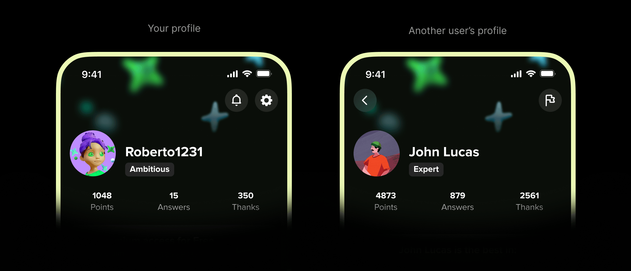
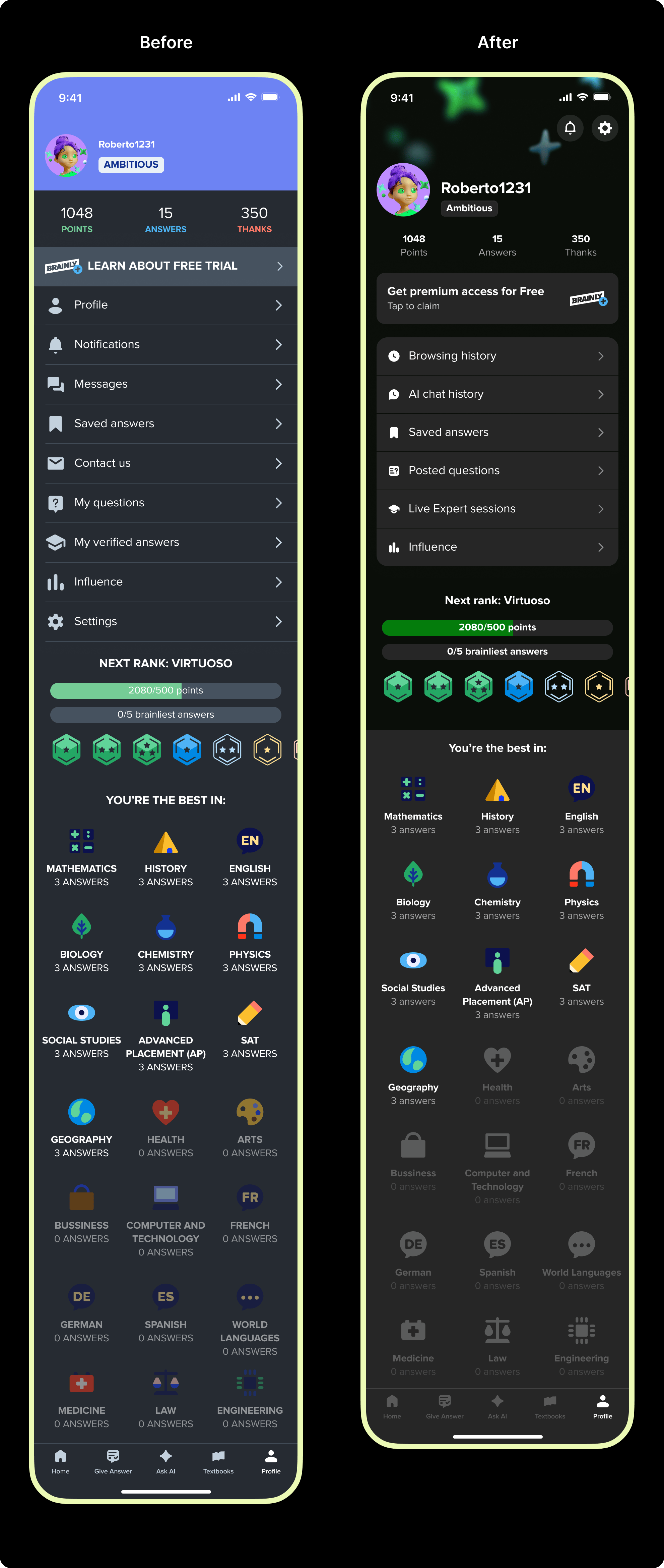
1 – Rethinking the header and profile summary
A new header keeps the playful tone of the profile without dragging too much attention. It blends seamlessly with the rest of the page and incorporates updated branding elements with a subtle blur for depth and focus. It’s designed to later support pre-made background options for personalization.
The avatar and username are now more prominent, making the profile feel more personal and user-centric. The rank label, which previously competed for attention, has been moved to a secondary position to reinforce a clearer visual hierarchy.
Profile stats (points, answers, thanks) are now presented as secondary information. Reducing their size, opacity, and capitalization relaxes their presence while improving contrast, making them easier to scan when needed.
Notifications and settings are now rounded buttons in the top-right corner, a familiar and ergonomic placement that follows Fitts’s Law. On other student’s profiles, they’re replaced by a single “Report” action, with a consistent “Back” button on the left. This unified layout works for both scenarios, eliminating the old drawer design and giving students a more predictable navigation pattern.
2 – A more persuasive, effective banner
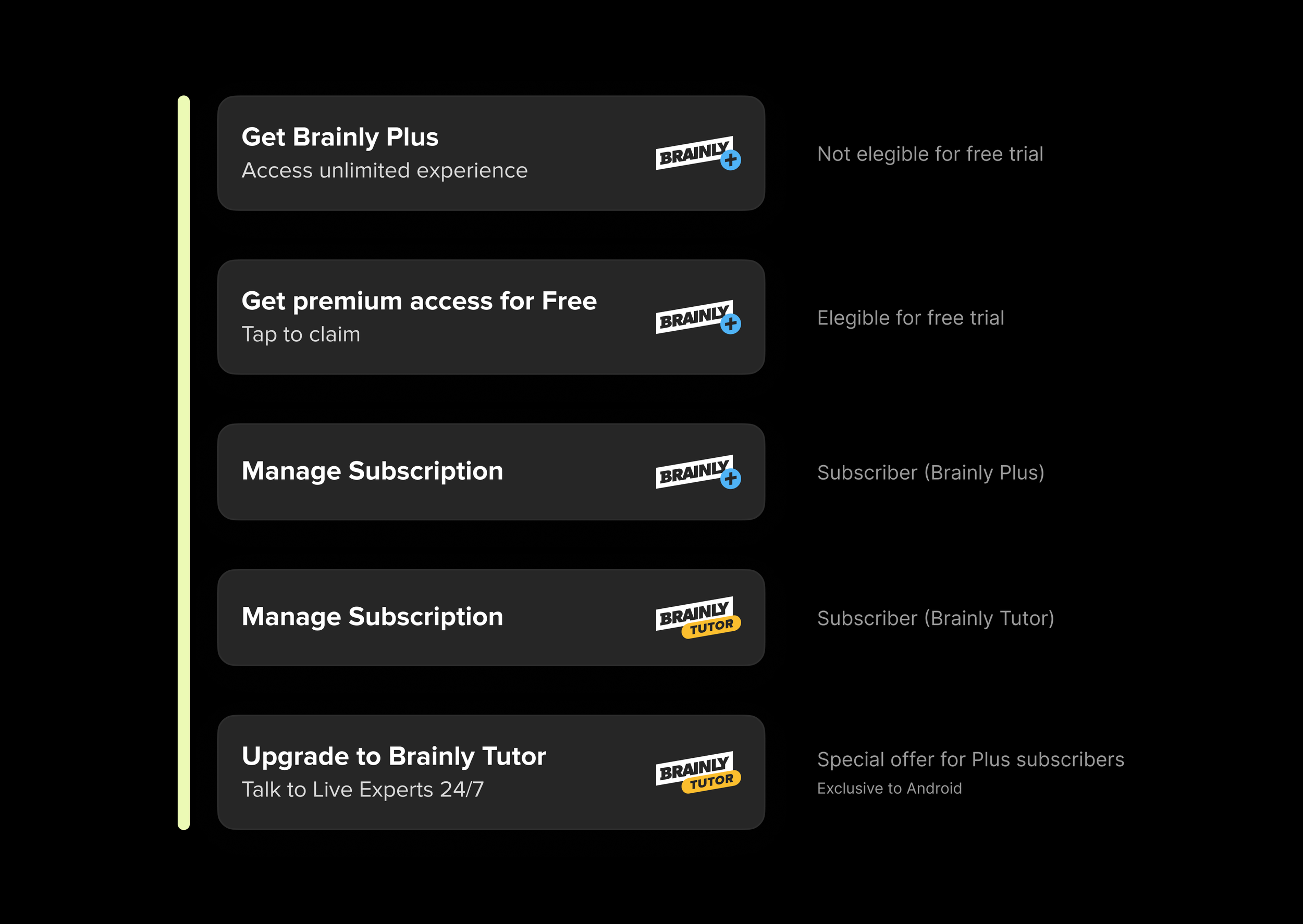
I worked closely with Brainly’s US-based Senior UX Copywriter to redesign the subscription banner into a single, adaptable component for all subscription states. The refreshed design improves hierarchy, branding, and spacing, while the updated copy is clearer, more actionable, and aligned with Brainly’s content strategy. The result: a banner that’s instantly recognizable, easier to maintain, and more effective at driving engagement.
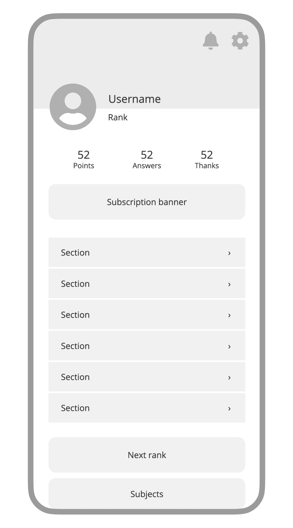
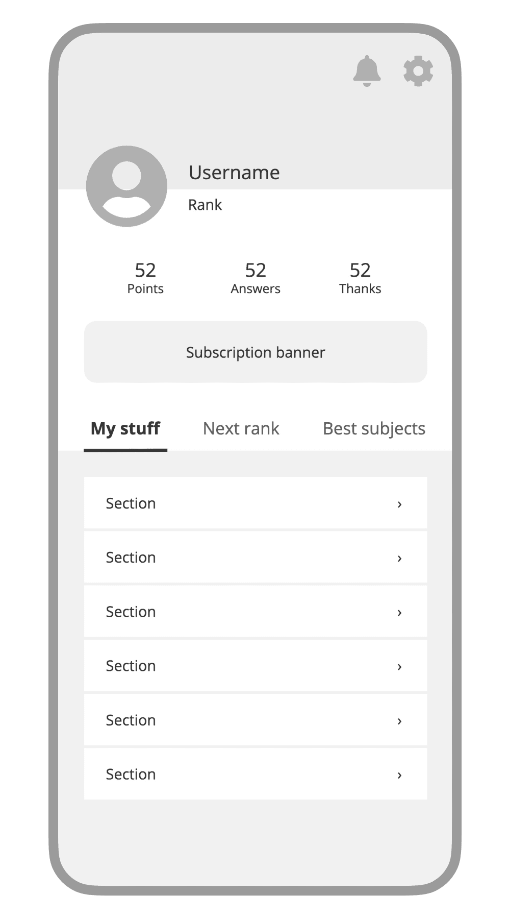
3 – Streamlining the profile menu
The previous profile menu was long, poorly organized, and mixed high and low priority actions. This made information harder to spot, contributing to the decrease in usefulness and the poor performance of this page.
In the redesign, the list was streamlined from nine items down to six, aligning with Hick’s law to reduce decision time. The new grouping reflects the updated information architecture, with all items tied to the student’s activity. The icons and cell styles now create a modern look and visually separate the menu from the other profile elements around it.
4 – Small tweaks to promising features
The Next Rank section was technically out of scope, but I made essential accessibility and typography improvements to align it with the rest of the profile and contribute to visual consistency.
5 – A clearer, more intuitive hierarchy
While I believe this section could benefit from a different structure, the MVP needed to stay close to what students already knew. Therefore, my focus was on improving hierarchy, accessibility and visual consistency.


6 – Light mode
Although dark mode was presented first here, both light and dark mode themes were designed in parallel to maintain consistency, hierarchy, depth, and accessibility.
I also partnered with our Design Systems Manager, using my experience with previous theme work to create a flexible, scalable color conversion aligned with the new branding.
The new light mode uses color more deliberately, guiding attention rather than decorating. A refined visual composition introduced rhythm and depth to create a clearer hierarchy that makes the page both more engaging and intuitive to navigate.
When comparing both light modes, these improvements become even more evident. Generous spacing, deliberate use of typography, and improved alignment come together to deliver a profile that’s easier to scan, more cohesive, and better equipped to support new features without adding clutter.
7 – A functioning, intuitive Settings page
In the previous design, Settings was buried at the bottom of a long menu, and on iOS, it opened an action sheet with a few unrelated options. Other settings were scattered across the main Profile page, making navigation inconsistent and slow.
The redesign introduced a dedicated Settings page, grouping all options into clear, manageable categories. Paired with visual hierarchy and dedicated icons for each setting, this made the page faster and easier to scan.
8 – Cohesive Notifications
The Notifications page adopts the same structure and visual hierarchy as the new Settings page, creating a familiar and consistent experience across these two key profile sections.
In the new information architecture, Messages now live within Notifications, reflecting their shared purpose of keeping students up to date and connected with the community.
Empty states were also overhauled with higher contrast and adherence to the platform’s navigation patterns. They now feature a more modern look that’s consistent with the latest branding, ensuring even inactive screens feel intentional and polished.
Realizing the opportunity
Outcomes & Impact
Looking back at the goals we set, the redesign delivered tangible progress:
Improved engagement → Profile visits rose by 30% and held steady beyond the novelty period, showing the section had regained relevance.
Increased conversion → The updated banner and improved profile experience led to a modest but measurable lift in free-trial sign-ups.
Consistency across Android and iOS → While some visual and structural differences remained due to a compressed launch, the platforms are closer in parity than ever before.
Reduced tech and design debt → Outdated patterns were replaced with scalable, maintainable components, cutting complexity and giving future projects a stronger foundation.
Beyond the original goals we set, the impact of this exercise reached into the team culture.
Proved the value of overlooked areas → We demonstrated that a low-traffic section can still deliver business value through design.
Increased stakeholder trust → This project sparked greater interest in team-lead initiatives, leading to direct collaborations with the CEO on future projects.
Boosted developer morale → Removing legacy code and working with modern tech made the project both enjoyable and efficient for the engineering team.
How we made it happen
Collaboration
This project was a true team effort. I had the privilege of collaborating with talented people who believed in the idea even when there were no guarantees.
Product Management → I’d be remiss not to credit the Senior PM who so persistently fought for this initiative, securing stakeholder buy-in when success was far from certain.
Engineering → From early scoping and estimates, to sharing valuable context from the previous profile, to polishing the final build, the engineering team approached every challenge with openness and proactivity.
UX copywriting → While I’ve barely touched on it in this case study, many of the most effective persuasion and clarity improvements came from our Senior UX Copywriter.
Design systems → Our Design Systems Manager ensured dark and light mode themes could launch in parallel, even though he was still finalizing the new brand palette.
Data & analytics → The data team provided the insights we had, and collaborated closely to measure the right outcomes post-launch.
Design handoff → Halfway through the handoff process, I was moved to a different initiative, and another Product Designer seamlessly took over final handoff responsibilities.
What this project taught me
Final thoughts
Determination is not stubbornness. Out of caution, I’ve sometimes hesitated to push too hard on ideas. Partnering with my PM on this project showed me that when the vision aligns with company goals and benefits multiple teams, persistence is not only valid but necessary. By communicating the case clearly, we turned a repeatedly shelved idea into an approved and successful initiative.
Progress, not perfection. While I initially wished the implementation had been more polished, focusing on an achievable MVP still delivered measurable improvements and set a strong foundation for future iterations. Past experiences had made me cautious, knowing that opportunities to iterate can close quickly. This project reminded me that patience and persistence can keep the door open, and that there’s always an opportunity, even in the overlooked.
What are your thoughts?
I’m always open to questions, feedback, or even a quick conversation about the work you’ve just seen.
Thank you for your time and attention :)