Double Tap: An exciting yet flawed Apple Watch interaction

On September 22, 2023, Apple unveiled the new Apple Watch Series 9 and Apple Watch Ultra 2, along with Double Tap, a watchOS 10 gesture-based feature that allows for convenient interactions. As the name hints, Double Tap requires tapping the index finger and thumb together twice to trigger the primary action on the display.
The main benefit of Double Tap is quickly interacting with the watch without having to touch the screen. This becomes handy when say, a timer goes off but your other hand is occupied, making it difficult to stop the timer. Up until now, scenarios like this have led Apple Watch owners to secretly perform an interaction that Apple likely never intended: a nose tap. Yup, nose tap. If you’re an Apple Watch owner you have probably done it, and you’re not alone.
Double Tap was the star of the Apple Watch segment of the keynote, with its own introductory film highlighting the uses cases and convenience of the feature. Apple went as far as developing a new machine learning algorithm exclusively devoted to better supporting this gesture, powered by an enhanced chip only available in the new watches.
This sounds familiar…
I was surprised to see that Apple never acknowledged the fact that they introduced a similar feature 2 years prior, with watchOS 8: Assistive Touch, an accessibility feature that supports a range of gestures that enable people with limited mobility to take full advantage of their watch.
There is also a separate accessibility setting called “Quick Actions” which enables a feature similar to Double Tap, even on older watches. There’s just a little caveat: since older watches don’t have the new S9 chip, these features are not so robust as Double Tap. They sometimes miss a tap or, in my experience, even refuse to work at all with certain apps. It is worth noting that unlike the new Double Tap feature, Quick Actions and Assistive Touch come disabled by default.
Answering a call using Quick Actions (or Assistive Touch).
Given all this, what strikes me is not only that Apple didn’t verbally acknowledge their accessibility features, but the fact that they didn’t seem to take inspiration from them when it comes to interaction design. Let’s take a closer look.
Quick Actions in action
Introduced in 2021, Quick Actions is part of the accessibility settings Apple brought to the Apple Watch. When enabled, it becomes available every time we receive a notification and raise our hand. It is limited to performing only one interaction with a given notification, for example:
Automatic workout detected → Start the detected workout
Timer goes off → Stop the timer
Receiving a call → Answer the call
Receiving a notification with no primary action → Dismiss the notification
Under Settings › Accessibility, there are two ways of enabling Quick Actions: with a “Full” or “Minimal” appearance. Full Appearance displays a temporary helper in addition to a blue ring highlighting the main action, while Minimal Appearance only displays the blue ring.
Full appearance on the left, Minimal appearance on the right.
Regardless of the setting, the interface does a good job at highlighting the option that is going to be triggered, what is commonly known as a signifier in interaction design. This means that we don’t have to guess which action we’re interacting with.
To properly compare Quick Actions with Double Tap, we need to be aware of three important system components that should be part of every interaction: affordance, signifier, and feedback. These are key aspects for achieving great User Experience design. This is how they apply to the example above:
• Affordance: The “Stop timer” action is shaped as a button with a well-known icon that represents the action to be triggered. The usage of color and contrast further contributes to communicate the interactive state of the action.
• Signifier: The blue ring around the button signals that the action can be triggered with a double tap, taking the guesswork out of the equation, and supporting our muscle memory by consistently appearing around the main action. The “Full appearance” variant has an even stronger signifier by supporting itself on text, leaving no space for misinterpretation.
• Feedback: When the action is triggered, the button responds by momentarily shrinking and then bouncing back to its original size, mimicking the reaction of a real-life button. This reassures us that the button was pressed. In this case, the same feedback applies whether directly tapping on the screen, or with the double tap gesture. This means that the feedback is related to the button and not the signifier, which is enough in this case.
Double Tap
Back to 2023, we now have Double Tap, which is more advanced and reliable than Quick Actions, allowing us not only to interact with the main action of a notification, but also to perform subsequent actions and interact with other parts of the interface beyond notifications.
Double Tap extends the idea of performing common actions to apps, and even to the watch face, by allowing us to bring up the Smart Stack and scroll through widgets. In this sense, there is no question that Double Tap is an evolution of Quick Actions, more mature and better integrated into the system.
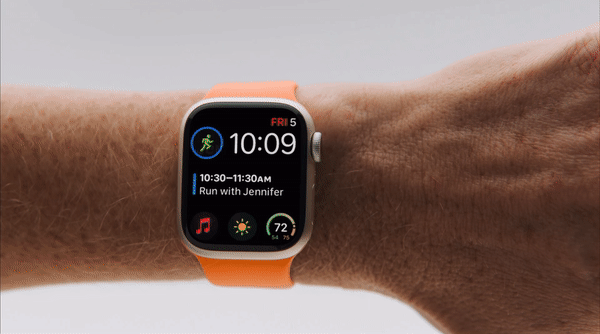
On their website, Apple does a really good job at showcasing several use cases:
“Play and pause music while carrying groceries. Answer a call while paddle boarding. Stop a timer while baking a pie. Reply to a message while walking the dog. Check your Smart Stack while holding your toddler.”
By looking at the images in this article, one could have the preconceived notion that this new feature is great. What’s so wrong about it? The main action clearly stands out, and there’s even an icon that shows that Double Tap can be used to trigger it! That’s good, right?
Well…
The thing is…
Actually…
Let’s just take a look at the entire interaction:
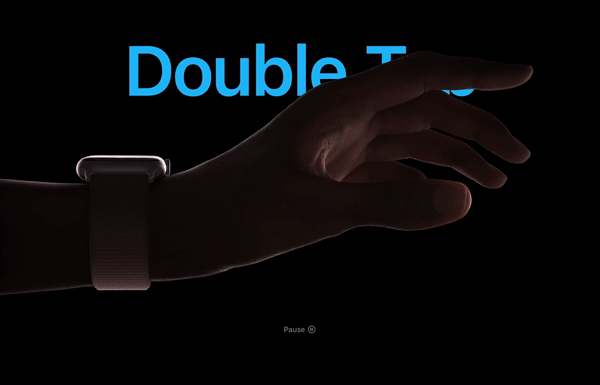
Oh.
What you see on the promotional images is what happens after you perform a double tap. Put simply, the issue here is that there’s absolutely no way to tell when Double Tap can be used. Remember affordance, signifier, and feedback?
Double Tap does incredibly well at providing feedback. It goes above and beyond by darkening the interface to show what you interacted with, and letting you know if it was done by double tapping. If you ever Double Tap something by mistake, you will not be able to undo the action (for now), but at least you’ll know how you got there.
But when it comes to the moment before you perform the action? While the Quick Actions did a great job at signifying, Double Tap couldn’t do worse. There’s nothing, not even temporarily, to let us know that we can double tap something. In theory, this means that the discoverability of this functionality is at risk, meaning that some people could never find out this gesture exists.
Believe it or not, there’s an action you can double tap here. And a bad pun too.
Worse yet, even if someone discovers this feature, they will still need to recall it (since there's no visual cue to remind them) and do some guesswork to figure out what action will be triggered when they double tap. For years, people have grappled with deciding which button to press when their alarm sounds in the morning (1), (2), (3). Now, imagine the sheer cognitive load of remembering and guessing for something that is not even visible on the screen.
This is why I’m surprised that Apple didn’t take enough inspiration from the Quick Actions UX. They got the signifier right once, how come they didn’t apply any signifier at all on this new take?
It’s not that simple
The tricky thing is that Double Tap doesn’t always replace an actual tap. As of October 2023, the Double Tap gesture can be used to trigger taps, scrolls, and even swipes. These are all different types of gestures that have been typically performed by a finger touching the screen, or by rotating the Digital Crown. Sure, it can be easy to communicate that you can use Double Tap on a button, but how to elegantly convey that you can scroll and swipe too?
I believe this is where Apple decided to make a trade-off: sacrificing an ideal user experience in favor of investing in a delightful experience for those who discover the feature—while ensuring heavy promotion not just to attract, but to educate future buyers on how it works, aiming to compensate for the trade-off.
Screenshot of the Double Tap promotional video. Is this the birth of an icon?
The truth is, Apple is in a unique position to do things that other companies couldn't. It's not the first time they've defied usability principles and gotten away with it. In this case, I believe they have the capacity, thanks to their extensive marketing reach, to turn this gesture into a widely recognizable icon (see the screenshot above) that becomes second nature for people buying an Apple Watch. If you're naïve enough to think you can also defy usability concepts for your company, you'll soon find out that no matter how much you advertise the feature, it's unlikely to succeed if it's not properly designed.
Sometimes you can’t force it
While Apple enjoys their unique position, it doesn’t always work out for them. It was precisely with the Apple Watch that Apple introduced a feature called “Force Touch”, which allowed accessing hidden menus and different actions through taps performed with more pressure than usual. Pressure sensors under the display recognized these touches, and a haptic engine provided phyisical feedback, making it feel like you were truly pressing deeper on the screen.
Eventually, this feature arrived to the iPhone display with the iPhone 6S, under the name of “3D Touch”. Similarly, 3D Touch allowed access to contextual menus and more advanced options that were not visible at first. Indeed, both Force Touch and 3D Touch didn’t have any visual clue to remind you that you could use them.
The result? The usage was so low (perhaps due to poor discoverability), that Apple ended up “evolving” the 3D Touch feature. They replaced the 3D Touch gesture with a less convenient long press (now called Haptic Touch). Thanks to this, they could remove the pressure sensor from the display to save space for other components. In retrospect, was it a total failure? Not at all, thanks to this, the iPhone got more battery life and haptics are now a key component of the feedback experience on the Apple Watch, iPhone and the Mac.
Although Apple graciously navigated the product design of these features, you would think there was a lesson learned about the risk of not making things obvious, yet here we are again. Will Double Tap be any similar to 3D Touch? Only time will tell.
Maybe Apple has a different Vision (Pro)
There is another key aspect to consider. We have a new player called Vision Pro, Apple’s mixed-reality headset revealed in June 2023 and set to be launched in early 2024. But how does Double Tap on the Apple Watch tie to Vision Pro?
One of the things that stood out to people who tried the device, was how intuitive everything felt, even if they only tried it for a couple of minutes. Many tech reviewers and journalists agreed on how natural the hand gestures felt, including the… double tap!
Perhaps, Apple is not even trying to match the Apple Watch Double Tap with the already existing accessibility settings. They’re likely thinking forward, and planning how to bring together all the devices for a more seamless and consistent experience.
But this brings more questions than answers. I wonder, for instance, what’ll happen when someone actively using Apple Vision Pro receives a message on their Apple Watch. Will a double tap affect both the VisionOS environment and the WatchOS one? Will one of them be somehow prioritized? Will future Apple Watches include a sensor that allows us to look at something and double tap to select it, like you can do on VisionOS?
Did I double tap on my Vision Pro or my Apple Watch?
Nothing makes me think that Apple will leave these aspects unaddressed. After all, their reputation is built on a seamless ecosystem where every device works in harmony. We’re still in the early days of VisionOS, and although WatchOS is close to being 10 years old, Apple keeps redefining the experience with features like this.
Apple can do better
While I’m aware that challenges are often more complex than they appear from an external perspective, I also believe in the value of critical observation. No design team, including Apple's, is immune to mistakes, and I don’t think we should normalize the fact that they get away with ignoring basic design principles just because they’re Apple.
As Don Norman, former Apple VP of the Advanced Technology Group, renowned usability expert and user experience pioneer, brilliantly stated in a fantastic article that unfortunately remains as relevant to this day:
Today, Apple’s products violate all the fundamental rules of design for understanding and usability, many of which Tognazzini and I had helped develop. As a result, even a manual is not enough: all the arbitrary gestures that control tablets, phones, and computers have to be memorized. Everything has to be memorized.
As an early adopter and avid user of the Apple Watch, I couldn’t be more excited about this new gesture, and I’m happy to see Apple leveraging accessibility features to further elevate the overall Apple Watch experience for everybody. However, as an Interaction Designer, I’m concerned that the current state of Double Tap could not only impede the average consumer from enjoying the feature, but also affect whether they discover it at all.
Interesting links
This video from Apple goes through the several Assistive Touch settings on the Apple Watch. As you can see, accessibility benefits everybody, and it’s always interesting to learn more about it.
I remember getting excited about the possibility of gestures on wearable devices the first time I learned about Google’s Project Soli. It’s still an interesting project worth checking out.
I’m equally excited about what the future holds for interaction design on mixed-reality spaces. In this podcast episode from Cortex, Myke Hurley shares his impressions after trying the Apple Vision Pro. It’s the most detailed description I have heard/read so far.